

London buses: unexpected legacy
A look at the progression of bus interiors that followed the New Routemaster.

tl;dr: The Boris bus laid the foundations of a unified design language for London bus interiors, but it seems to be facing resistance.
London bus interiors are a bit of a mess - first-world problems, I know. The Boris bus at least brought fresh ideas and design perspectives, even if, as a project, it ultimately flopped.
Each operator uses a standard interior, generally the same in London as elsewhere, specifying wall panels, floor coverings and seat types to match their company colours and branding.
What’s out there
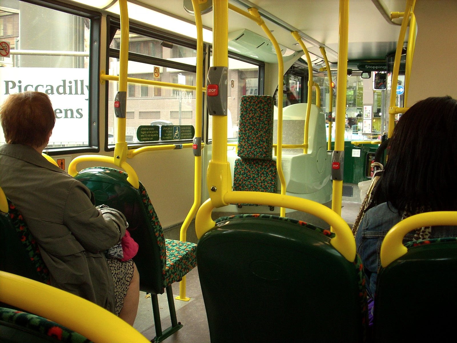
For the sake of illustrating my point about the variety on offer, I want to take a look at the main operators’ interiors. To avoid overloading this post with photos or descriptions, I’ve put together a little visual rundown of colour palettes and a snippet of the seat pattern for London’s major operators.

While I’ve always had a passion for graphic design and colour theory, I have the sum total of zero formal training in this area and therefore don’t really have the words to verbalise how I feel about each one (but given I have strong opinions, I’m not about to let that stop me!)
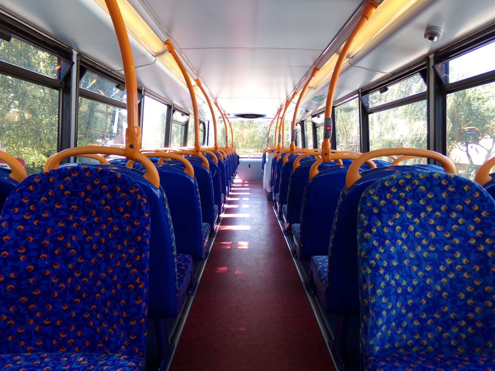
I’ve always been a big fan of Stagecoach’s interior - it’s bright, bold and full of character. The design is over two decades old, and while I believe they’re retiring it, that’s a mistake (I still like it today as much as I did as a 10-year-old bus foamer, go figure).
The interior used by Go-Ahead is inoffensive and sensible - the colours may not be bold like Stagecoach, but they’re… fine? The seat pattern seems completely disconnected from their brand identity, but I don’t think this is really much of a problem.
The others, though? They’re all either depressing, disjointed or both - chasing uninspiring and frankly underwhelming corporate colour schemes that scream “meh”. The colour palettes just don’t “go” - there’s something distinctly off about the colour choices, and it all just feels unnatural.
While it sounds awfully ‘wishy washy’ coming from me, colours affect moods, and on buses we splash these colours on every surface until they become a defining feature of the passenger environment. Look again at the second column above (handlebar colours, though I left that unsaid) - which colours feel right, and which don’t?
I know it sounds like pseudoscience, but picking the right colours - even the right lighting - is just as important as making sure the seats are comfortable and the wheels don’t fall off.
A good example: compare Stagecoach’s standard interior (above) with the ‘eco-green’ version they introduced on early 2000s hybrids - some of which still haunt East London.
Which do you prefer? Why? Still think colour isn’t important?
The nonsense of it all
Now, none of this actually makes sense - a key part of TfL’s bus franchising system is that the network should be operator agnostic as far as the passenger is concerned. They get to have their logo on the outside of the bus in a limited number of positions (which have recently been reduced) and internally, you’ll only find their name - not logo - on the passenger information signage.

Passengers don’t link their journey to the operator - they relate it back to TfL. In my home town, they’d blame it on Stagecoach if a bus broke down - here in London, TfL takes the flak. So these interiors only serve to advertise operators that passengers aren’t even meant to notice. It’s truly bizarre.
The Boris bus interior
When we look at the above rainbow tapestry of colours and seat patterns, it didn’t take much for the Boris bus to stand out in terms of passenger environment.
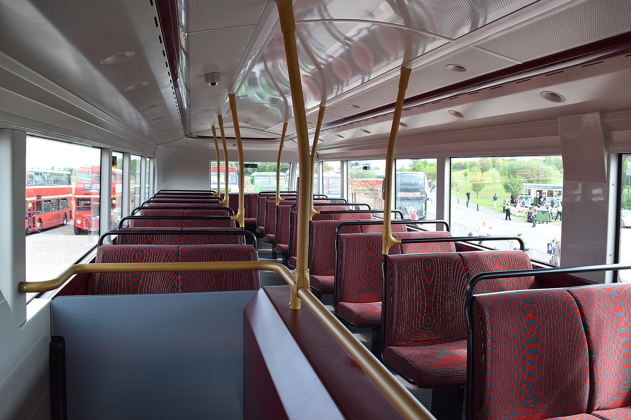
The Boris bus interior isn’t really comparable to anything before it. Gone are the bright brand colours; this was a professional design, considered and deliberate. It was meant to say “This is a London bus”.
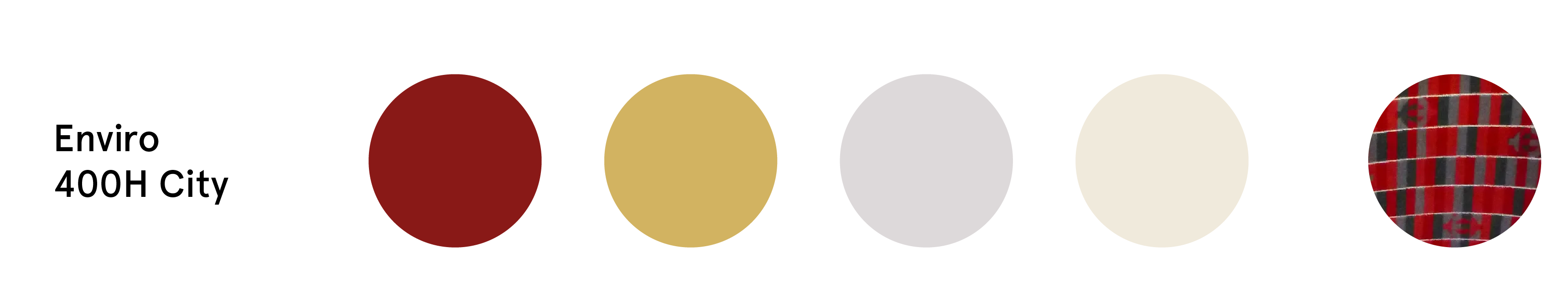
Enter the New Routemaster interior colour palette:
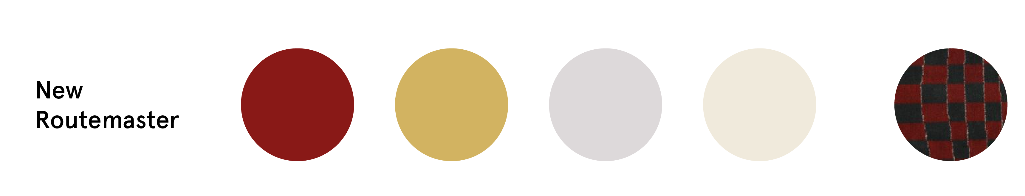
Rich burgundy, bronze (perhaps gold) accents, with neutral wall panels and flooring. The burgundy and bronze is bold, but it’s also understated and gives a certain air of quality. It says “this is a premium product”, maybe?
But as we know, the Boris bus project is dead.
Ah well, that was a nice idea - back to Stagecoach blorange, I suppose.
The Boris bus influence
If we look at the New Routemaster project as what it should’ve been - a concept design or prototype - then what results should be obvious: analysis of what works and what doesn’t, the best features taken inspiration from, and those which were a bit too ‘out there’ ditched and not spoken about anymore.
The perfect example of this being done is the Enviro400H City, by Alexander Dennis (ADL), released in 2015. Externally, the resemblance is uncanny: fully glazed staircase, wrap-around windscreen, curved rooflines - all unmistakably descended from the Boris bus. Thomas Heatherwick welcomed ADL’s Enviro400H City as a “back-to-front” compliment.


And the pattern of taking inspiration continues inside, where things are strikingly familiar:


The colour palette is near-identical, but rather than being applied to bespoke fixtures and fittings at premium cost, it instead follows ADL’s existing interior style specified with standard components.
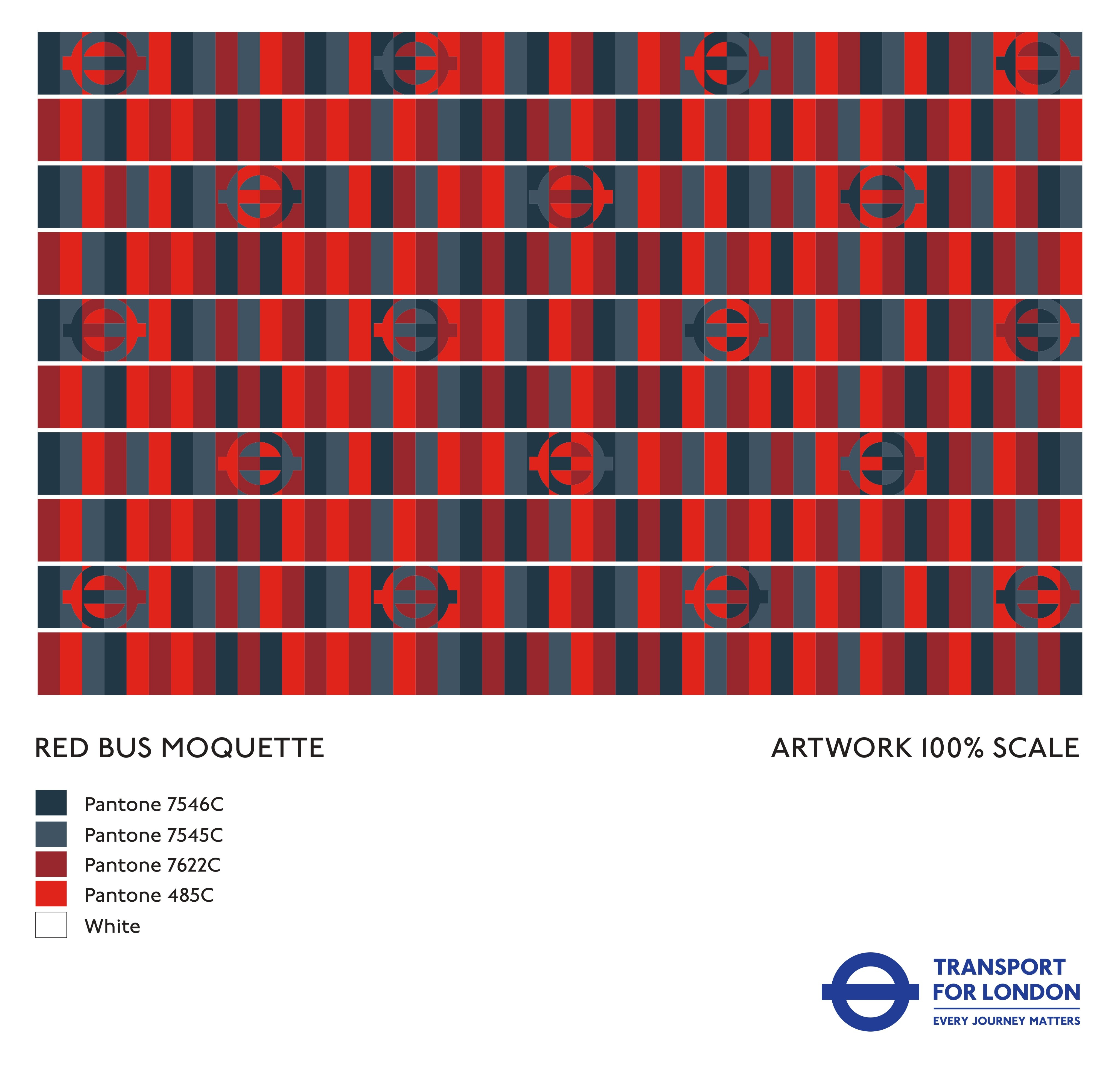
A sign of good things to come, you’d hope, would be the introduction of the TfL Red Bus Moquette, designed by Camira Fabrics, which screams London in part due to the roundels and otherwise the style of the pattern. It’s not a random scribble - it’s intentional design.
All of these things together
The Enviro400H City launched in 2015, along with the TfL Red Bus Moquette (unless otherwise specified by operators), and my understanding is both were fairly universally well received (I like it, anyway).
Together, these should have formed the basis of a coherent visual design language for London’s bus interiors. We have red on the outside - this is what we should have on the inside. There’s no justification for allowing - let alone even perhaps encouraging - operators to fit out their buses with these clumsy corporate interiors that detract from what should be a consistent passenger experience.
Ten years on, the Enviro400H City has been superseded by the Enviro400 City EV and now the Enviro400EV - all superb buses. But with hundreds of new vehicles entering London bus operators’ fleets each year, the TfL interior inspired by the Boris bus has largely vanished. Recently though, Stagecoach, who even had the nerve to strip it from some of their 400H Citys (Cities?), have now started specifying the Red Bus Moquette on new orders - a small mercy.
Any claim that operators’ ownership justifies the inconsistency of not having a unified TfL interior doesn’t stand up to scrutiny. Vehicles are already built to TfL’s 591-page spec, and are refitted before leaving the capital - at a minimum, the middle door gets removed.
This is exactly where Transport for London should be curtailing the creative freedom of operators and enforcing coherence. This is where TfL usually shines and pulls no punches, so I’m incredibly curious as to why they don’t here.
This post is part of an ongoing series about bus interiors in London.
Previous post:

Next post:
