

First train? Who could say...
One day this went backwards and now it affects millions of people.

tl;dr: The replacement of a 1960s ‘first train’ indicator introduces friction for every passenger who uses this busy station, and it’s not clear why.
At Walthamstow Central tube station, there’s a thing. This isn’t a post about it specifically, because that’d just be trivia, but instead about what it serves as a rather good example of - how seemingly insignificant changes can have a big impact when large numbers of people are involved.
Context.
Walthamstow Central is the northern terminus of London’s Victoria line, which opened in 1968. A vision of the future, it featured all-singing-all-dancing signalling and somehow, automatic train operation (the system behind which was frankly an engineering marvel).
Like all of the line, the platforms at Walthamstow are at deep level, beneath a set of London Overground platforms and a bus station, and are accessed by escalators (or stairs). In the morning peak, huge gluts of commuters make their way down these escalators at once, wanting to board the first train and be whisked away to work.
It’s laid out like this:
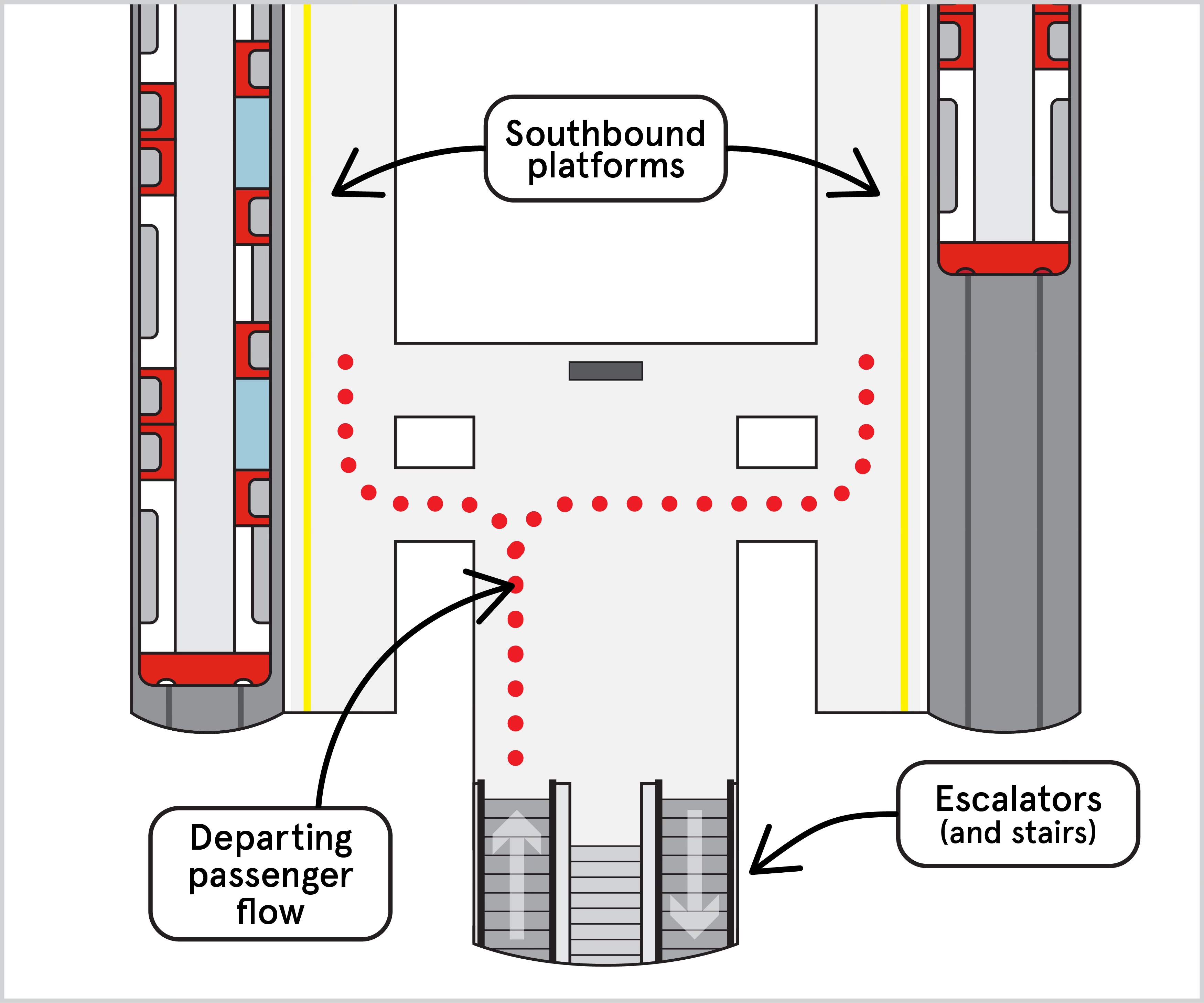
At the bottom of the escalators, there’s a problem: Southbound trains leave from either platform - how do passengers know which one is next? It’s a decision point.
Well, the boffins of the 60s had this covered, fortunately.
The thing.
Between the two platforms stands a totem sign, atop which the words “first train” are emblazoned in large letters with an arrow pointing right, and then again beneath this with an arrow pointing left. Its functionality is pretty simple - depending on which train is signalled to depart next, the appropriate bit lights up.
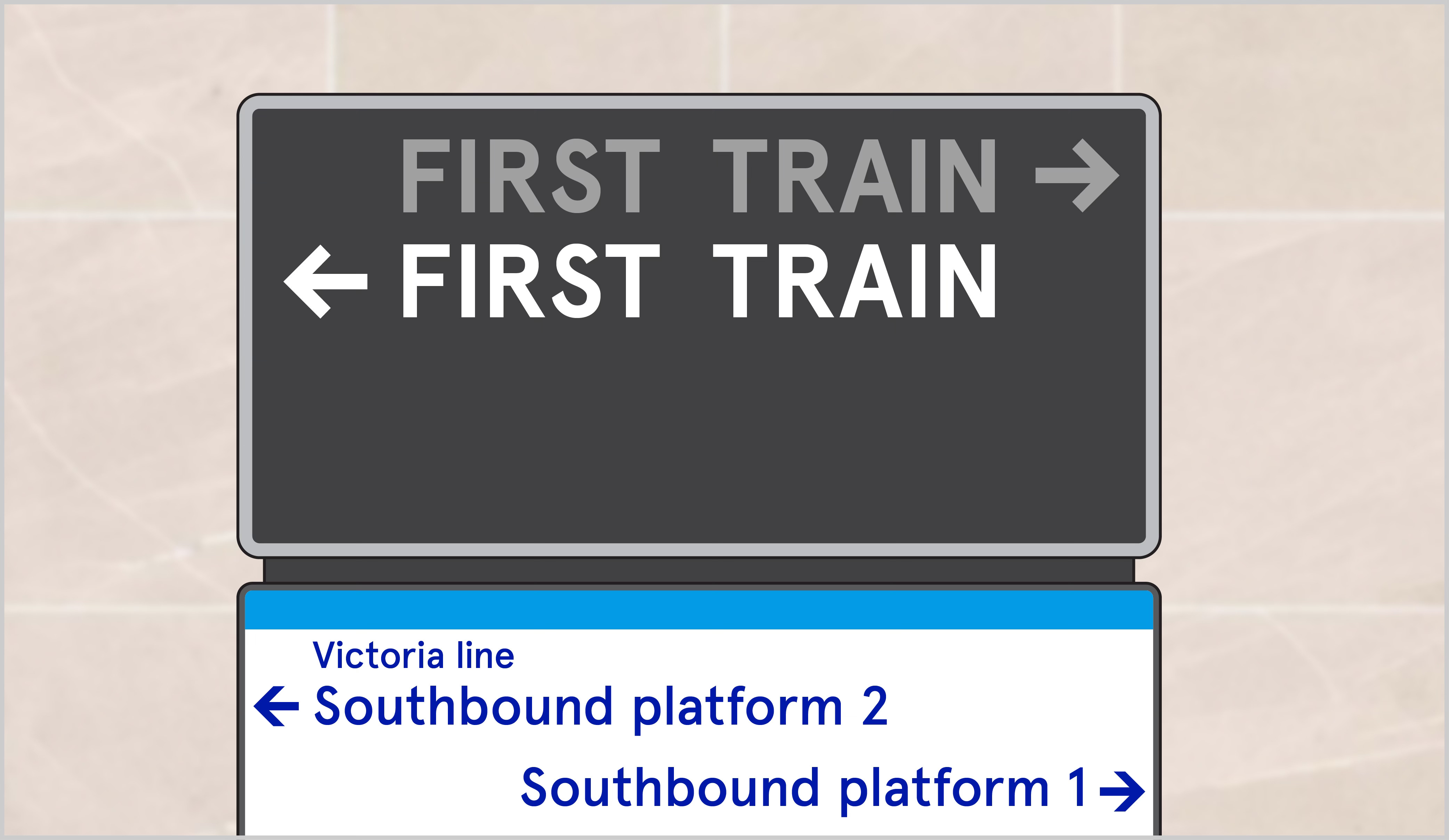
The utility of this, I hope, is obvious.
Vast numbers of people coming down the escalator need to know if they’re going left or right. And with the Victoria line’s packed timetable, there are often trains in both platforms simultaneously, so it’s not simply a matter of looking to either side.
The sign makes it clear, both at a glance and from a distance, and with no ambiguity, which train will leave first.
Nice-to-haves.
Sometimes things like this are painted as optional niceties. (After all, we should be grateful to have an underground railway running all the way into central London every few minutes and at impressive speed.)
But they’re not - they’re a fundamental part of station wayfinding and optimise a passenger’s journey.
Up to 19 million people use Walthamstow Central every year, and despite being the end of a line and out in Zone 3, it was the fifteenth busiest station on the entire London Underground in 2020. Each one of these passengers boarding a Victoria line train steps off the escalator and has to know where they’re going.
This tiny part of their journey needs to function smoothly.
Today.
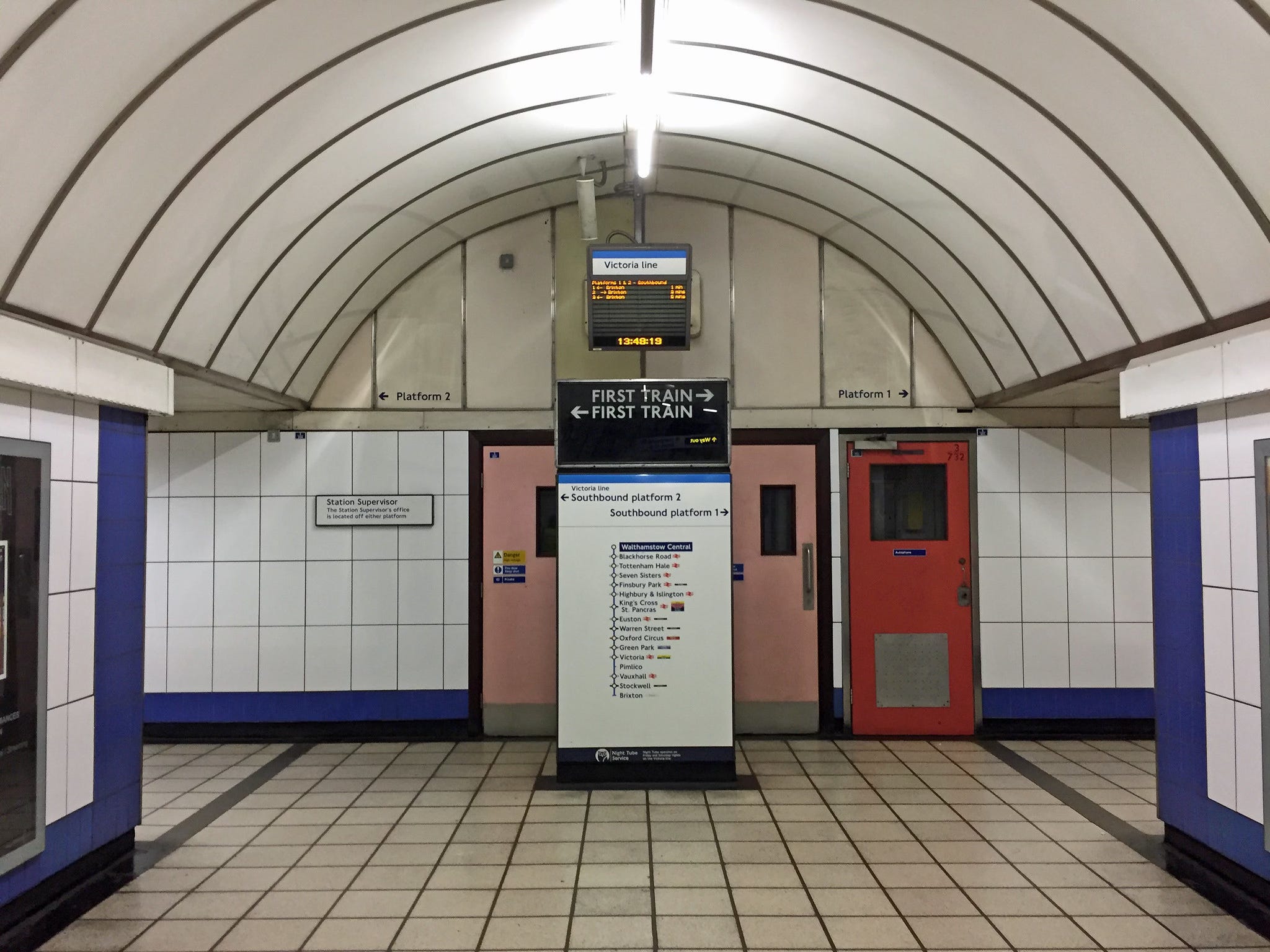
Where this is going will probably be quite predictable: Today, the sign is still there, but it doesn’t work any more.
When the Victoria line was re-signalled in the early 2010s to allow for greater service frequency (a ridiculous 36 trains per hour in the peak), the sign ceased to function.
What remains instead, is an LED matrix screen above it, which lists the next three trains, each with a small arrow pointing left or right:
Cumulative effect.
As mentioned, Walthamstow Central can get busy.
I’m not sure how they divide up the passenger numbers between those using the Victoria line and Overground given they share gate lines, but pre-pandemic numbers have around 18.9 million entries and exits recorded for the Underground part.
With some back of the envelope maths - let’s say 50% of that figure to look at just the entries, and say each person spends half a second at the bottom of the escalator deciding which way to go. That’s nearly 13,000 seconds per day, or just over 3 and a half hours.
Perhaps I’m being dramatic, but is it really OK to leave passengers squinting up at a tiny little screen for 3.5 hours per day?
Why is this OK?
It’s easy to just shrug this off as “oh, that’s a minor inconvenience…” given for each individual passenger, that’s all it is. But if you zoom out from that, it represents a cumulative, invisible tax on passengers’ attention and focus. It introduces a tiny bit of friction to every passenger journey, making it less convenient than it ought to be.
And for what?
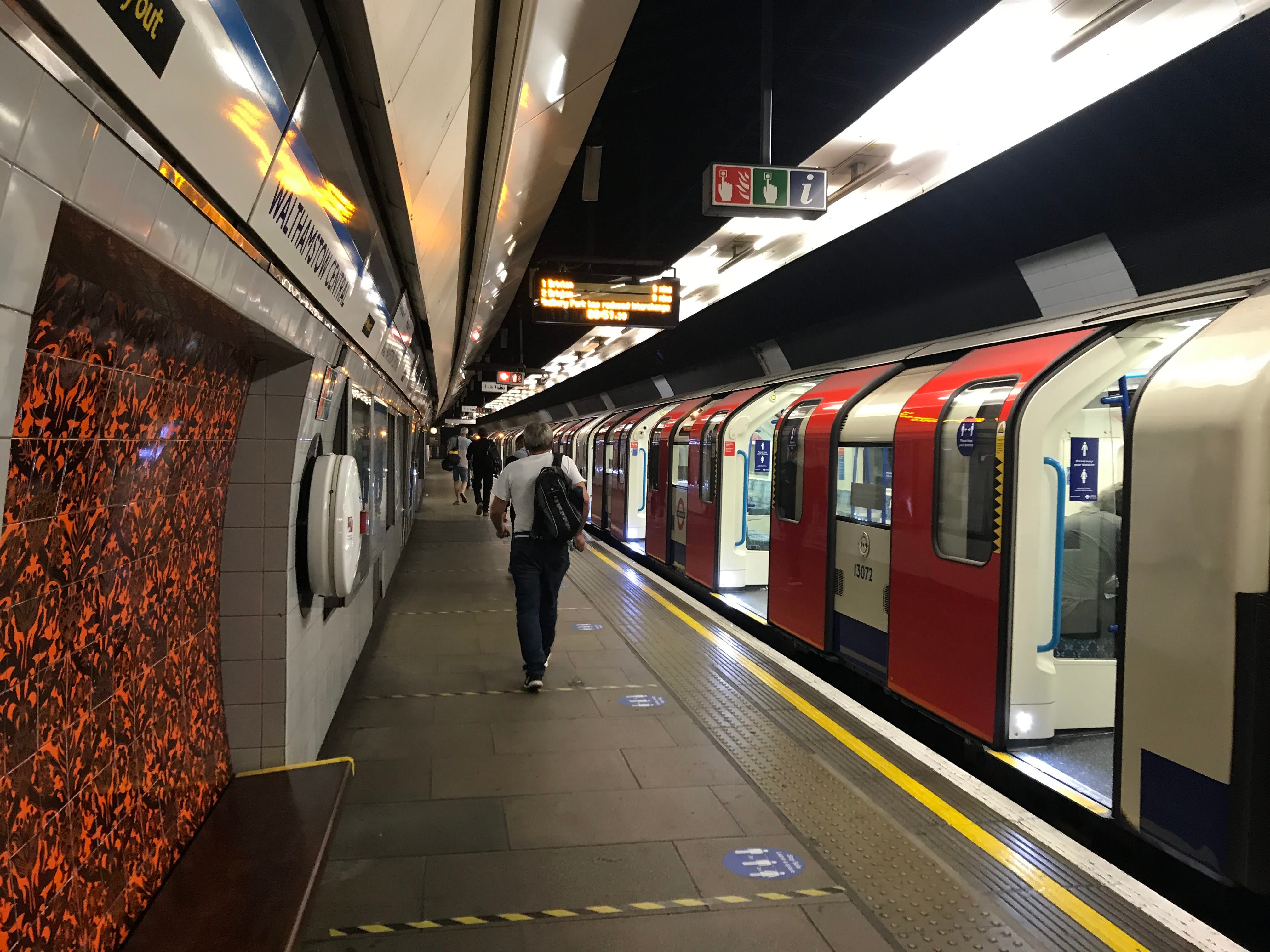
I’d really like this to be one of those posts where I find out that there’s an actual underlying justification for what seems to make no sense - like the accessibility rules behind train door buttons (that aren’t totally coherent), or the rationale behind putting sign language on screens (even though it doesn’t really go far enough) - and this is where I’d put the big reveal.
Alas, this is not one of those posts.
What this is instead.
From what I can tell, this is simply… regression?
I can’t seem to find out how much money was spent on re-signalling the Victoria line, but I’m sure that it will have been an eye-watering sum. Controlling 47 trains running between 16 stations through 26 miles of underground pipe is probably quite a complex task, and so it seems doubtful that it came down to cost.
And while I understand that in a project of this scope, it’s possible that someone noticed the problem of “this sign won’t work any more” but didn’t think a great deal of it - after all, it’s a fairly minor thing, right?
These micro-decisions are important, though.
This problem was thought about and addressed in the sixties, with an elegant solution put together to simplify the lives of those who’d use a line which had yet to serve its first passenger. And that’s even taking into account that the Victoria line was built to a cost - it wasn’t a lavish project like, say, the Elizabeth line seems to have been.
This is not a nice-to-have, it ought to be a need-to-have.
Obviously, the replacement is poor - it’s small, hard to read, and as a result not all that accessible. But that’s not why it’s bad. The reason it’s bad is because of the number of people that have to put up with it.
I have no nostalgia for the old sign, but I respect that it existed. I respect that someone identified a problem before a single passenger was able to experience it, designed a solution, and that this solution operated for over 40 years. It became part of the background so much so that it seems to have been forgotten about - and it should have been the baseline.
It’s really curious that people just accepted the change, and now here we are 10-15 years later. And it’s almost darkly humorous that the old sign is still there - its former function obvious but no longer served, right in front of the millions of passengers who otherwise would continue to benefit from it.
The natural points of argument are pointing blame (“who thought this was acceptable?!”) or talking about cost (“why waste money on something so trivial?!”) but I think this is one of those scenarios, as ever, where nobody really thought about it.
And someone needs to think about these things. Someone must.
You can’t inconvenience millions of people a year “because nobody thought about it”.
Do better.
5.3.3 VEIDs
5.3.3.1 There shall be a minimum of one VEID on each platform.
5.3.3.2 All VEIDs shall be sited so as to ensure that sightlines are not unnecessarily compromised.
5.3.3.3 VEIDs shall be clearly visible and legible to customers as they enter the platform from any station routeway and from the middle of the platform.
5.3.3.4 VEIDs shall be controllable from the local station control point, line control rooms and network control centres as appropriate.
5.3.3.5 VEIDs shall show as a minimum:
• The anticipated length of time before the arrival of the next three trains;
It’s exactly the same at Brixton, the other end of the line. The problem is that the new indicators aren’t intuitive like the old ones. They are also much smaller and less readable.
A crucial difference is that the new indicators now show the trains’ destination. For the great majority of travellers from Brixton this is irrelevant. All trains go to Victoria, etc., etc.
But newish travellers from Brixton don’t necessarily appreciate that it’s a terminus, so they spend time working out which train they want.
Is there a tfl rule that requires indicators to show destinations?