

Crisis in orange.
Was this the best way to fix the Overground’s identity problem?

tl;dr: They named each of the Overground lines, but the way they did it probably just introduced other problems.
I’ve lived in London now for a fair few years, but as a kid I was obsessed with the tube. When visiting each summer, I’d dutifully navigate my family around clutching a pocket map, in addition to planning our journey there with a road atlas (which is like Google Maps, except printed out1). I remember my first tube journey and where I got my first Oyster card, and am pretty sure I once convinced my dad that the nearest tube station to our hotel was in Morden so I could ride a chunk of the northern line.
This having been said, I wouldn’t claim to be a bona fide tube nerd by any measure - I just have a keen interest.
But regardless, if you were to ask me about the various lines and their colours, I could tell you what they were, and given enough time could probably find a close enough match for each in a Pantone swatch book.
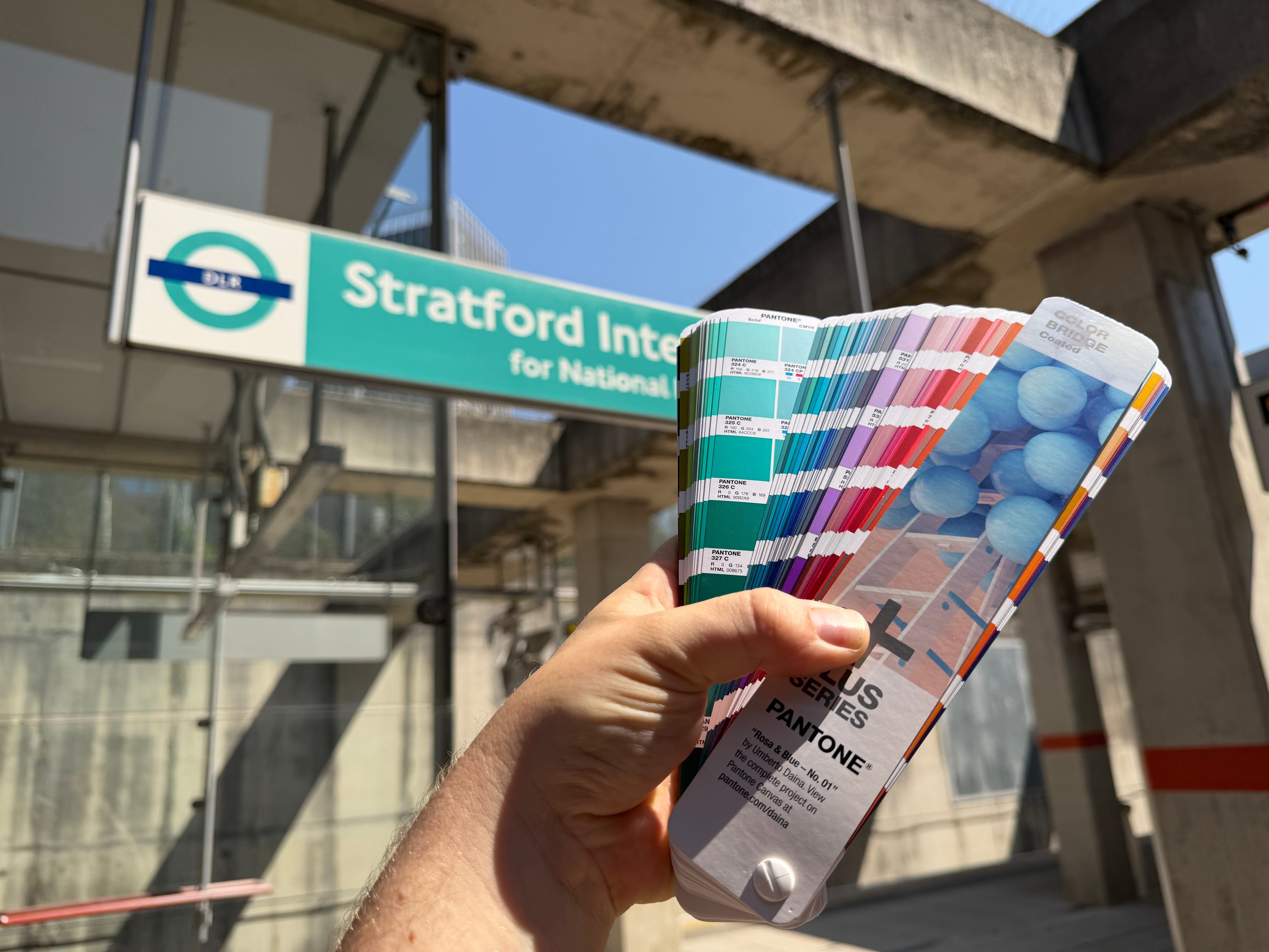
In 2024, however, the various routes of London’s Overground were rebranded and given their own names and colours, and despite it now being nearly two years later, I can’t honestly say I know them.
Why is that?
Is it because they’re new, or part of a bigger problem?
Oranging.
From its inception, the Overground has been orange. And it’s a bloody good orange, too, if you ask me - Pantone 158C, to be precise.
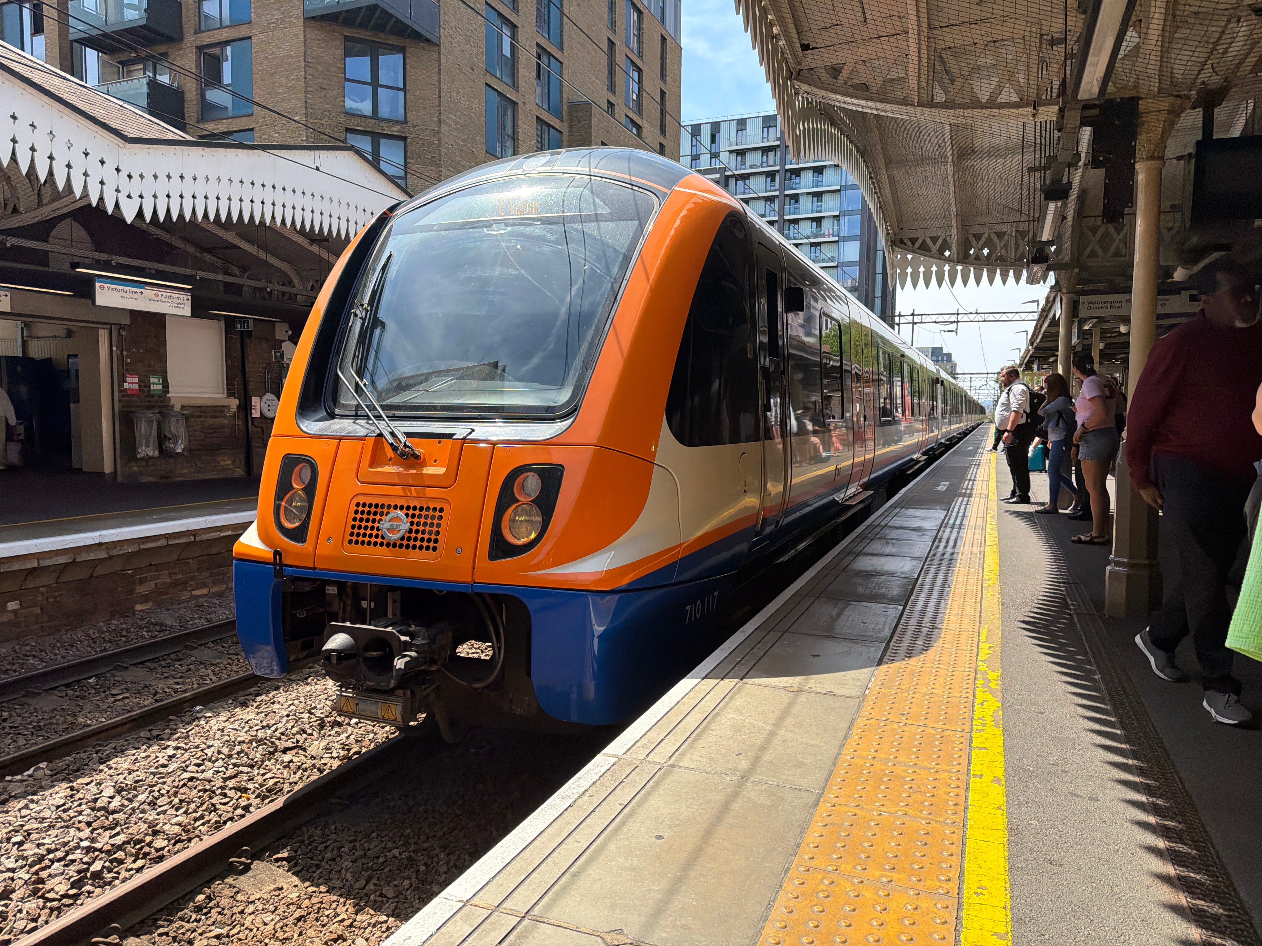
The Overground came about by TfL taking over various metro rail services around London and has expanded over the years since its creation in 2007. I’ve lived on the Overground for the past eight years, and well, I can’t really complain.
But one problem with the Overground comes down to the fact that it is, by nature, a bunch of different and not-necessarily-interconnected rail services around the city. It’s in Hertfordshire, Clapham, Surrey Quays and Emerson Park. And operationally, these services seem to be independent of one another, for the most part.
This means that when things go wrong - say, there’s service disruption or a line closure - they have to find a way of distinguishing between each route, which until recently, was done like this:
“The London Overground has severe delays *heart sinks* between Stratford and Clapham Junction.” *oh that’s ok then*"
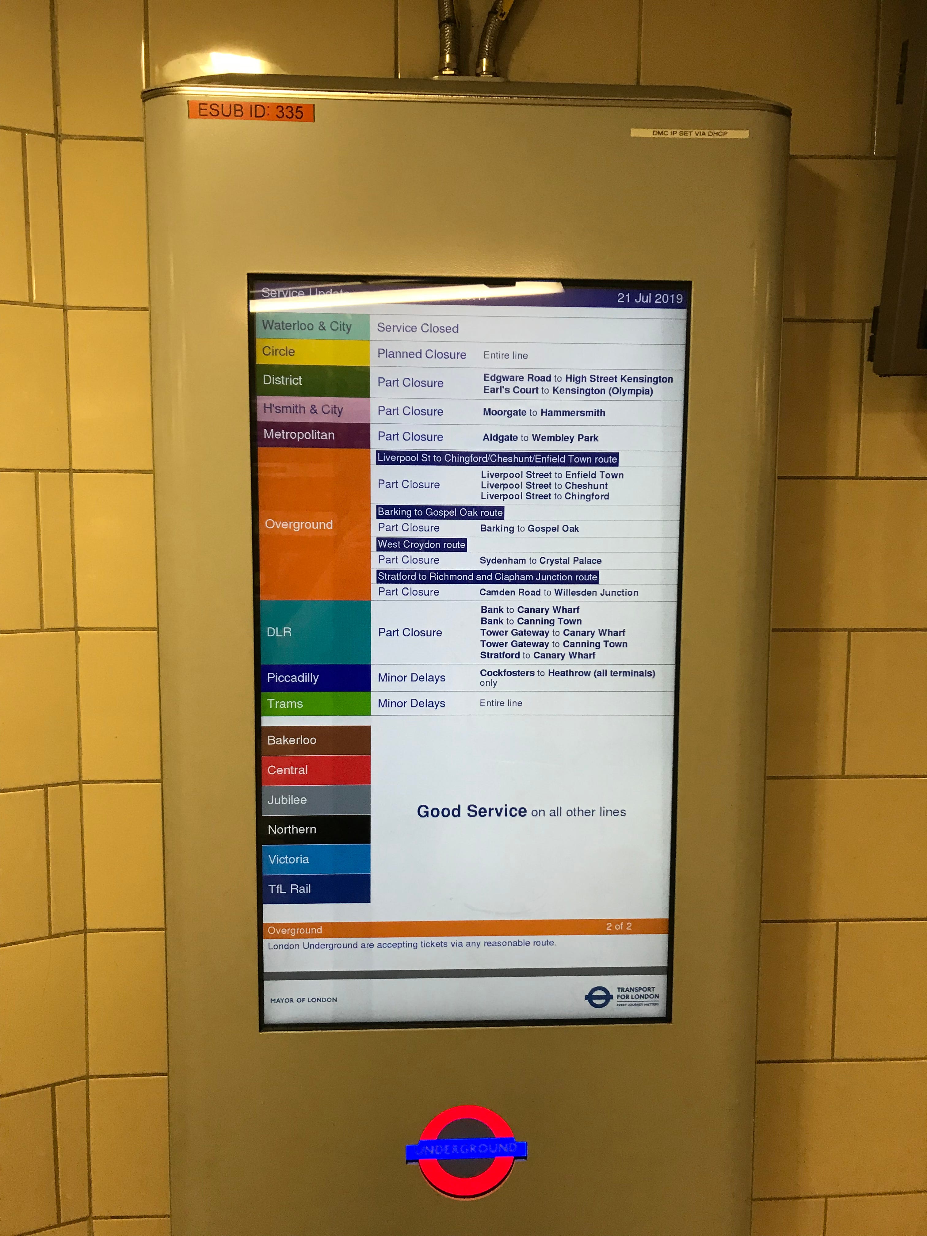
“The London Overground is part suspended *heart sinks again* between Chingford and Hackney Downs due to a problem with the overhead lines.” *gosh damn it*
And how exactly are tourists, visitors or even just Londoners who are not in their ‘ends’ (am I Londoning properly yet?) expected to manage with the various different routes? I’ve known of people clumsily taking entire journeys by Overground, just because their final destination happened to be on it. If I’m in Clapham and want to get to Clapton, the best route is probably not to spend my time trundling the whole way on the Overground.
In fact, here’s an Overground network diagram that was used in trains until fairly recently and, in my opinion, ought never have existed:
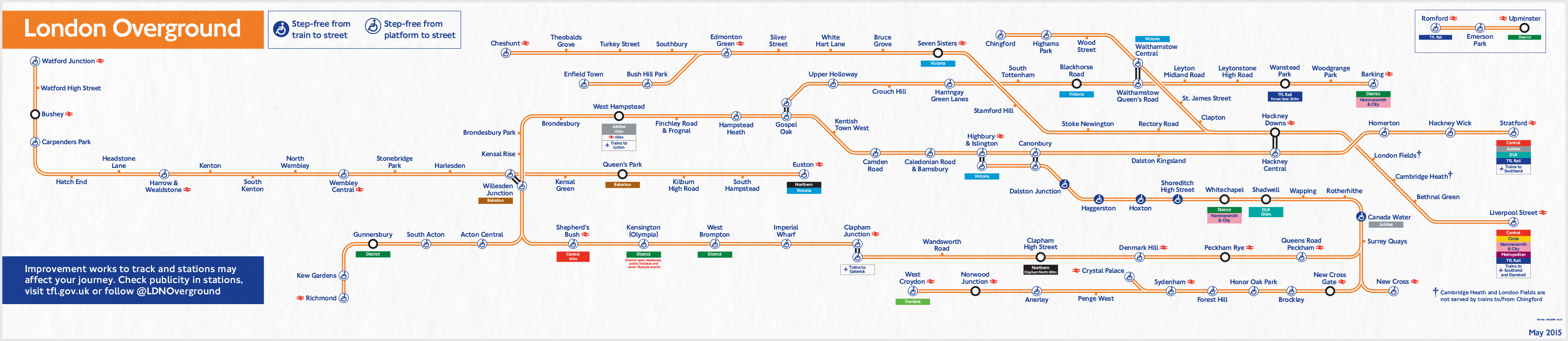
Not only does it warp geography in unfathomable ways by folding parts of London in upon itself, it represents a network in isolation that need never be navigated in isolation. If a tourist finds their destination on this map, they might miss a much more obvious way to get where they’re going by another means.
The Overground exists as part of London’s wider transport network, so why would you find this useful?
Mapping and moding.
Despite its name, the tube map isn’t just a map of the Underground, and these days also shows the DLR, Elizabeth line, Trams, Cable Car and Overground. (There’s also Thameslink, although I understand this is only temporary, so let’s just pretend it’s not there.)
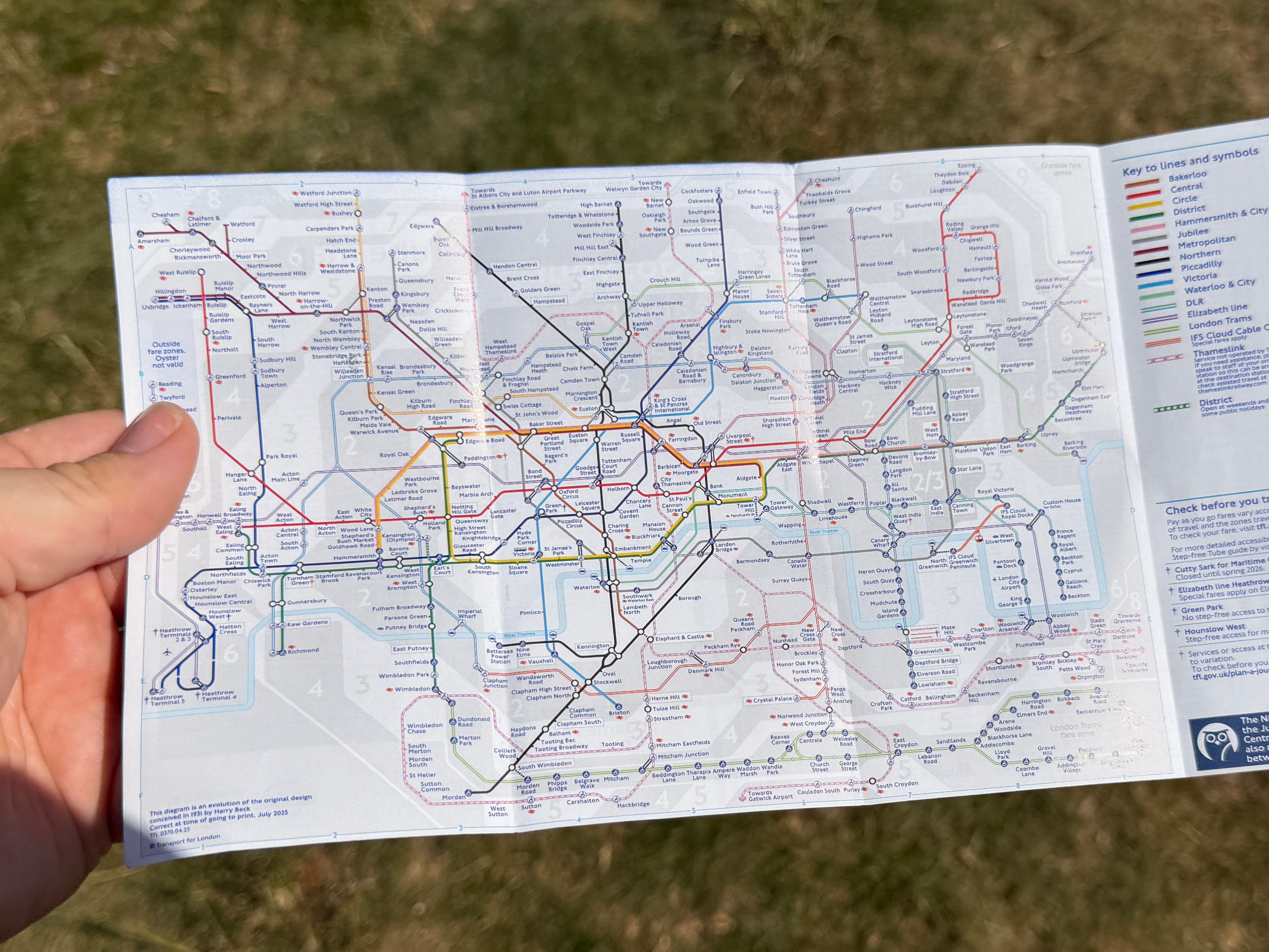
In TfL parlance, each of these is its own “mode”. On the tube map, these additional modes are represented by pairs of coloured lines rather than the solid lines used for the Underground. The DLR is in teal double lines, and the Overground in orange double lines, and so on:
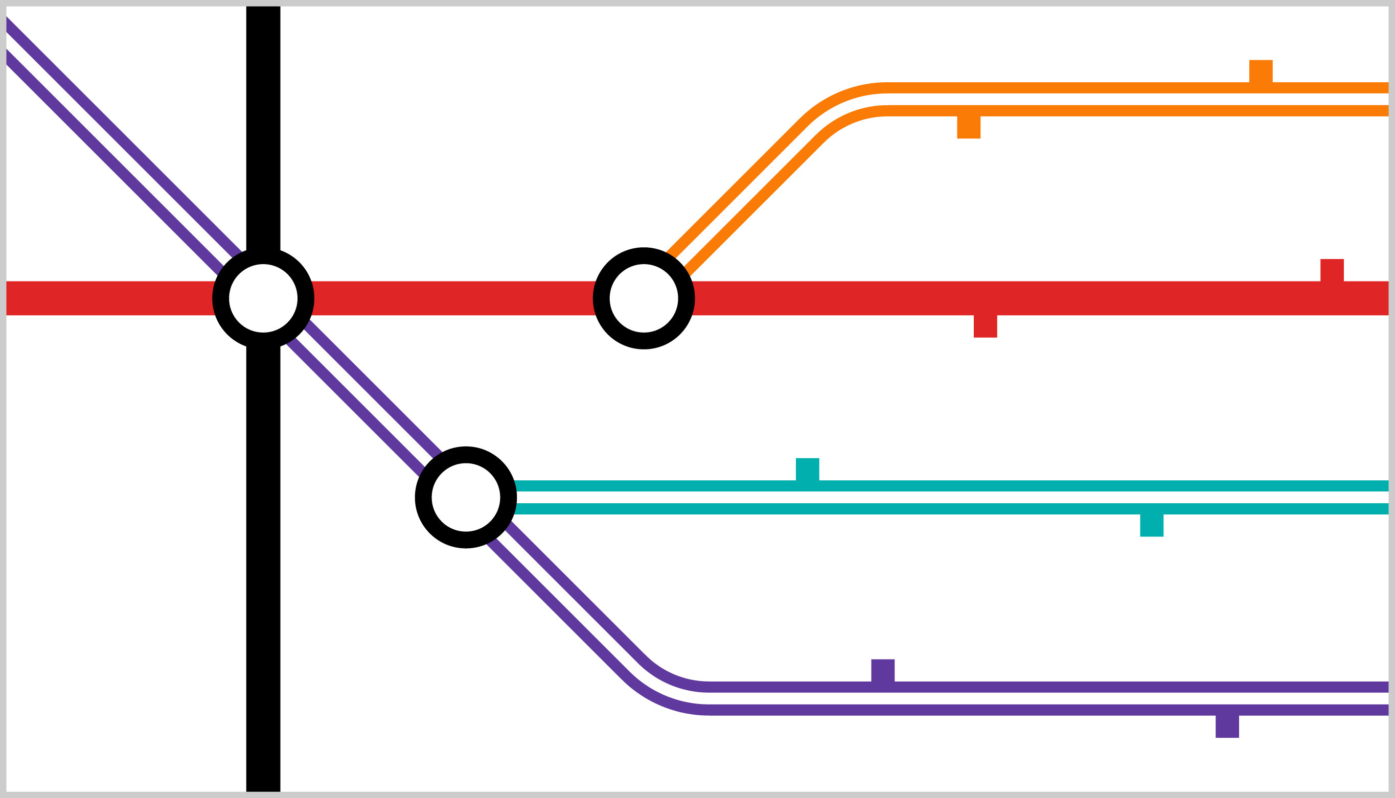
One unfortunate effect of this is that the Elizabeth line (which despite being named a line is actually its own mode - thank you, Boris) appears as an unimportant pair of purple lines meekly ducking and diving through Central London like an afterthought, despite being one of the best ways to get about.
How we represent things is important, especially on the tube map, which these days is already very crowded (another post to come at some point). Using colours carefully is a key part of this, as there are already quite a lot of them, especially when you bundle in various extra modes.
Naming
As part of his re-election campaign in 2021, incumbent Mayor of London Sadiq Khan pledged to rename the various Overground lines (or rather just name them, I suppose). And, in 2024, he set about doing exactly that.
Now, there are lots of ways to differentiate between lines on a transport network map, but in London at least, the way it’s done is using a name and associated colour. Elsewhere, you might find letters, numbers, letters and numbers (and probably other clever things I haven’t encountered or considered).
And Sadiq had already decided they were specifically to be named - not just differentiated between - and so the Overground was divided into six “lines” each with their own name, and their own colour, which look like this:
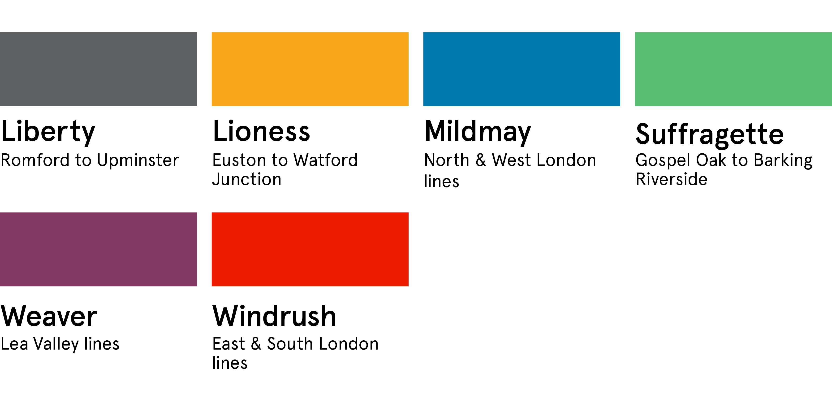
Each one of these names has a justificatory story which in some cases tenuously relates it to the area it serves. I can’t say I’m a massive fan of them.
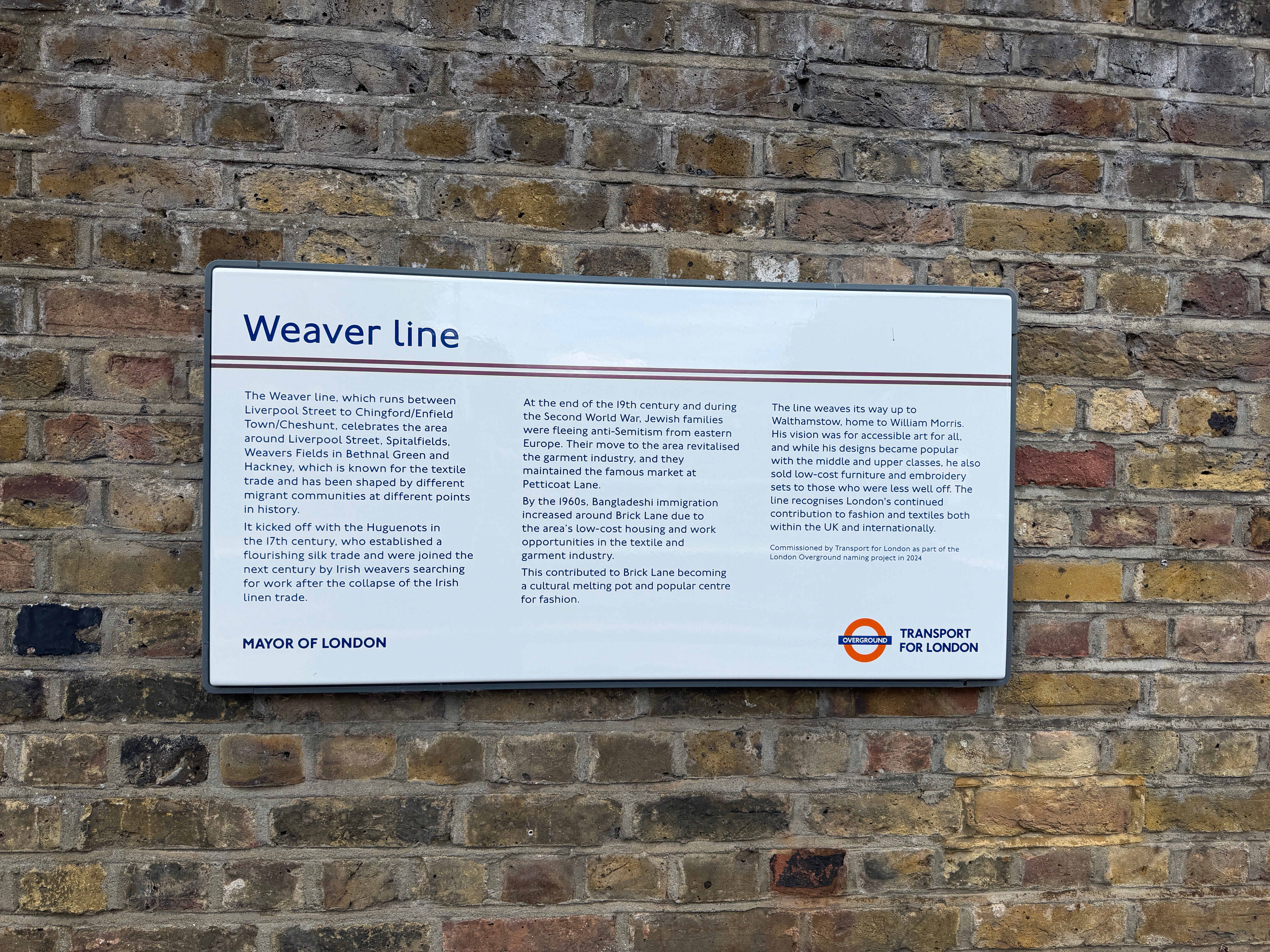
It’d be easy to criticise these names for being not overtly geographical, but then neither are the names of the District, Jubilee or Metropolitan lines, for example. I think part of the problem is naming things after the fact and trying to force a new identity onto something that people may already have a concept in their mind of. “This is called X now” is hard to get used to (take note, Elon) - my mum still calls Cif ‘Jif’.
But I guess we’re doing names now, so these will have to do.
Overloading.
The tube has eleven line colours, and then once you throw in various other modes you’re into the mid-teens on the map. In the hierarchy of the system - sure, the Overground lines are lines of a mode and so if we’re following the Underground rules, ought to have their own colours and names too. That logic is hard to argue with.
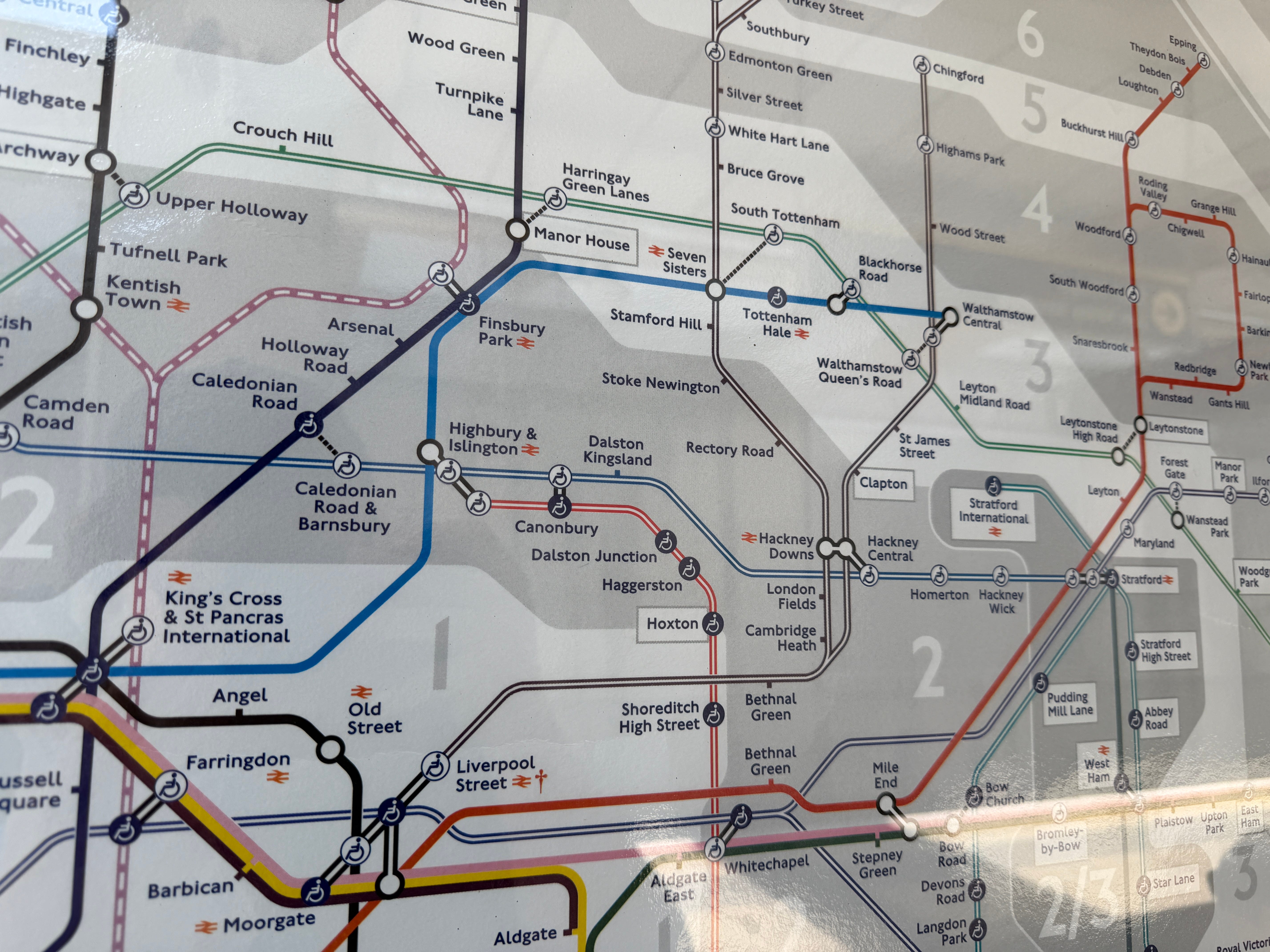
On the tube map, TfL have chosen to recolour these new individual Overground lines in their new colours (using the double lines used for secondary modes), meaning each one is given as much visual distinction as the Elizabeth line or entire DLR.
And in the key, they separate these out from the list of Underground lines with a header that says London Overground. (I just noticed they suffix them each with “line” too… why?)
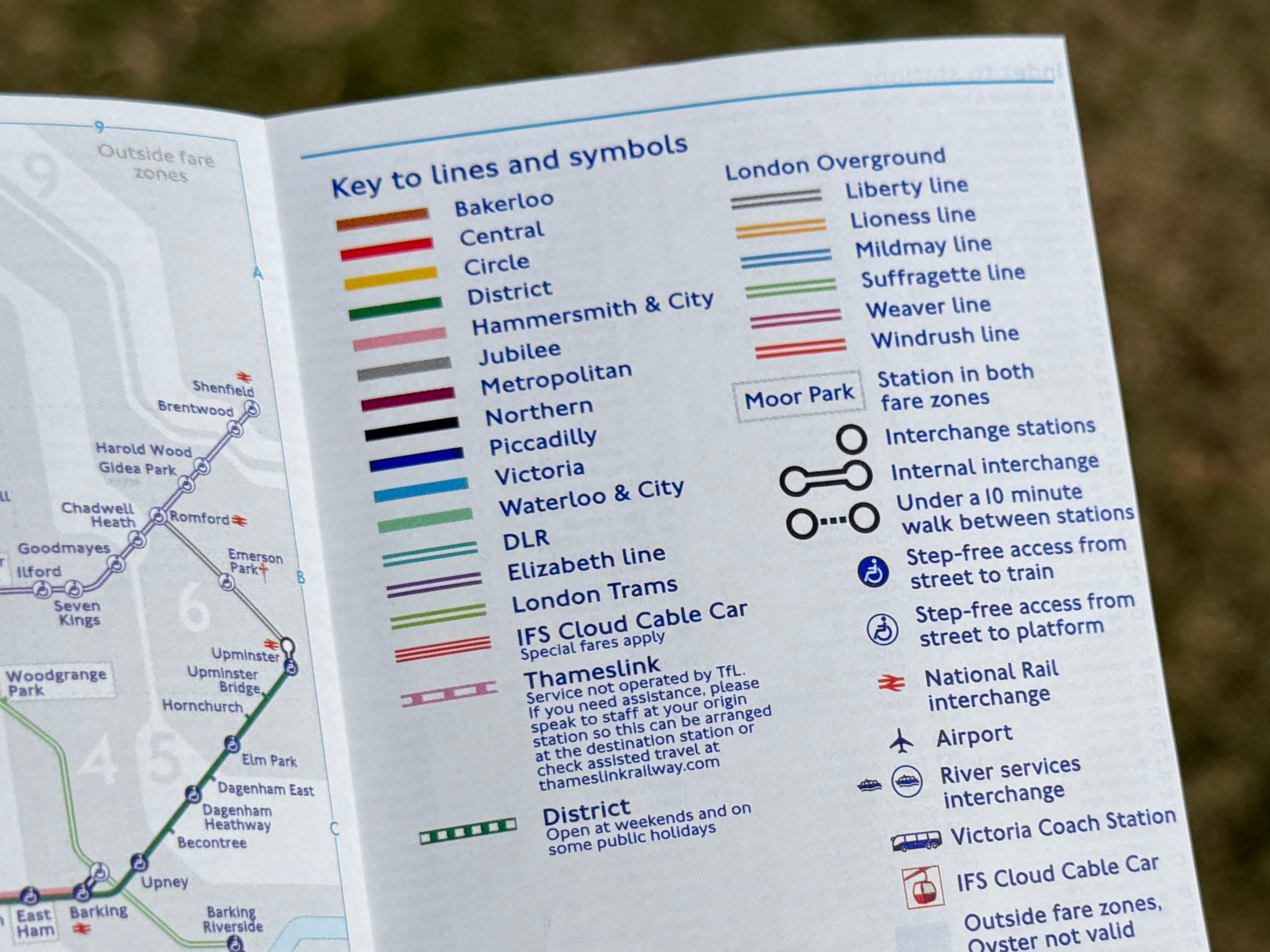
This leaves us with a tube map that has twenty-ish different line representations to pick and choose from. The Mildmay line is in a blue that’s not too dissimilar to the Victoria line’s, but apparently this is OK because it uses double lines instead of a single solid one. The Weaver line is in a dirty purple, and again looks vaguely close to the Metropolitan line.
We’ve kinda muddied the waters a bit here, no?
Representing.
If we look at the DLR on the tube map, it’s all in a single colour, just as the Overground had been previously. The only point at which you get to find out about the various different routes operated on the DLR is once you’re at a DLR station or on a DLR train (hopefully one of the new ones, if they ever come back).
This is progressive disclosure: until you’re on the DLR, the route detail isn’t really relevant, and other maps that happen to show the network aren’t overloaded with that extra detail.
Here’s an example of a DLR network diagram that uses varying shades of teal to distinguish between each route. The routes don’t have names, so elsewhere still get referred to by their endpoints:
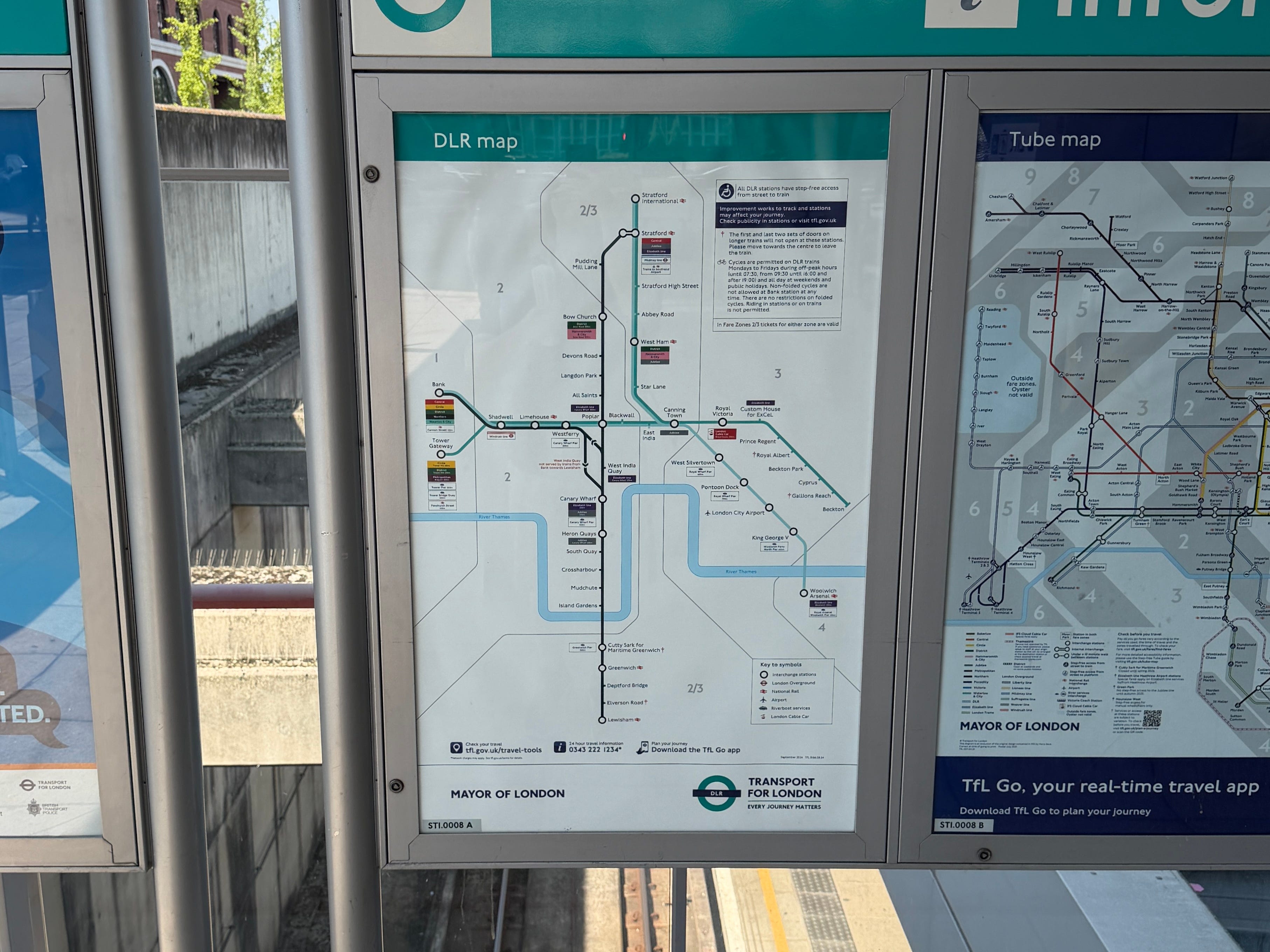
This works, because the DLR is a dense, pretty compact network covering East London, something which the Overground very much isn’t.
I’m not sure an equivalent would actually work for the Overground, because the various lines are spread across the city and so it’s not even remotely as self-contained a network as the DLR.
But supposing we wanted to keep every Overground line orange, the visual language of the tube map doesn’t really offer us a way to do it. We could use different shades or line patterns, but there’s no obvious way to distinguish between them without introducing another visual cue. The London Rail and Tube services map tries different line patterns, but that only gets down to separating by operator, and still ends up a complicated mess.
Weaving.
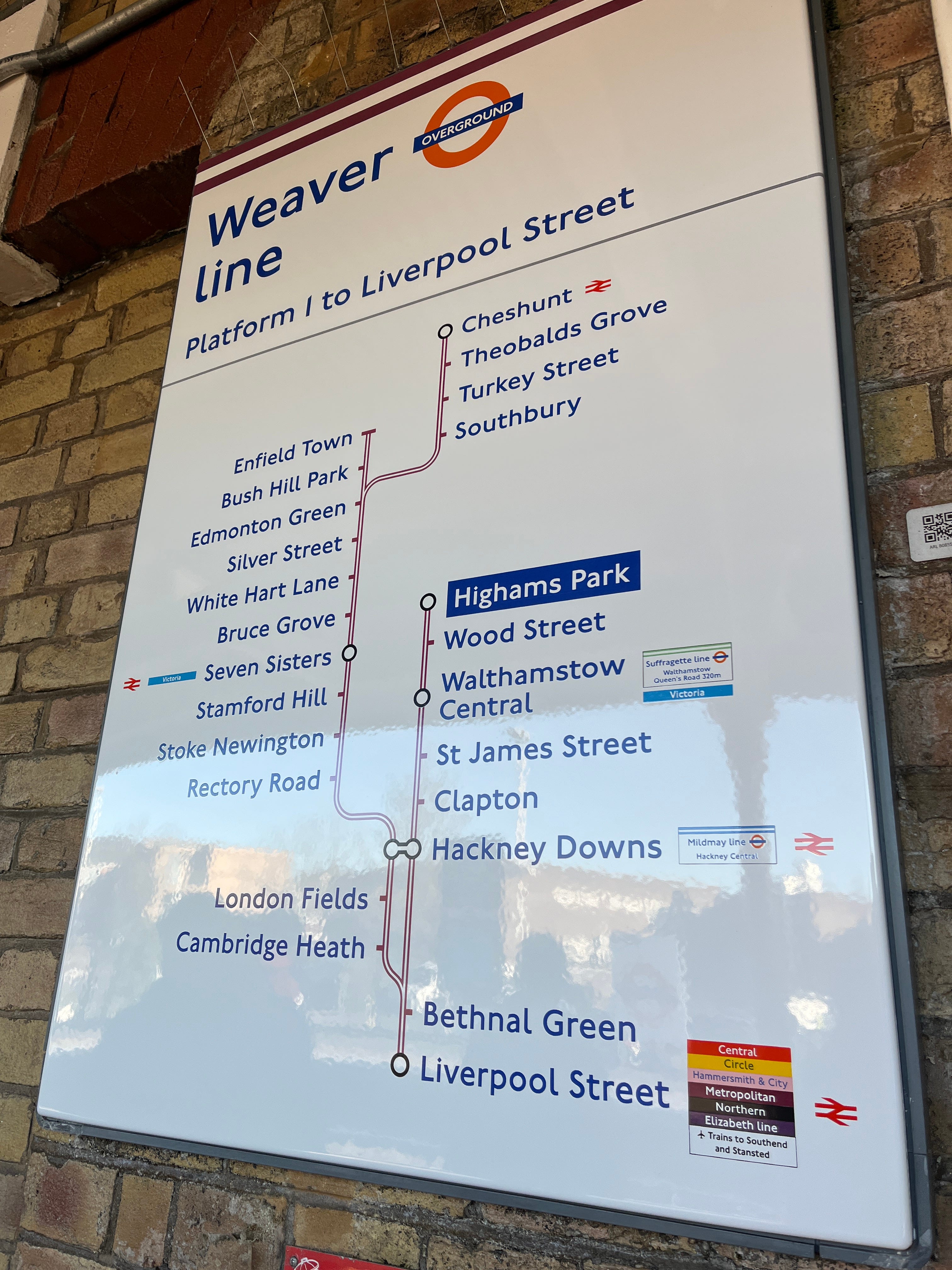
What they’ve done with my local line, now known as the Weaver line, is particularly curious. The objective of separating all of the lines with individual identities was to eliminate ambiguity for passengers. And for the other lines, the way they’ve been done is pretty defensible.
The Weaver line starts at Liverpool Street, uses its own set of trains and drivers, and runs on a single timetable. The problem, though, is that beyond that, it’s kinda hard to argue that it’s a single line.
Here’s a line diagram (the top part):
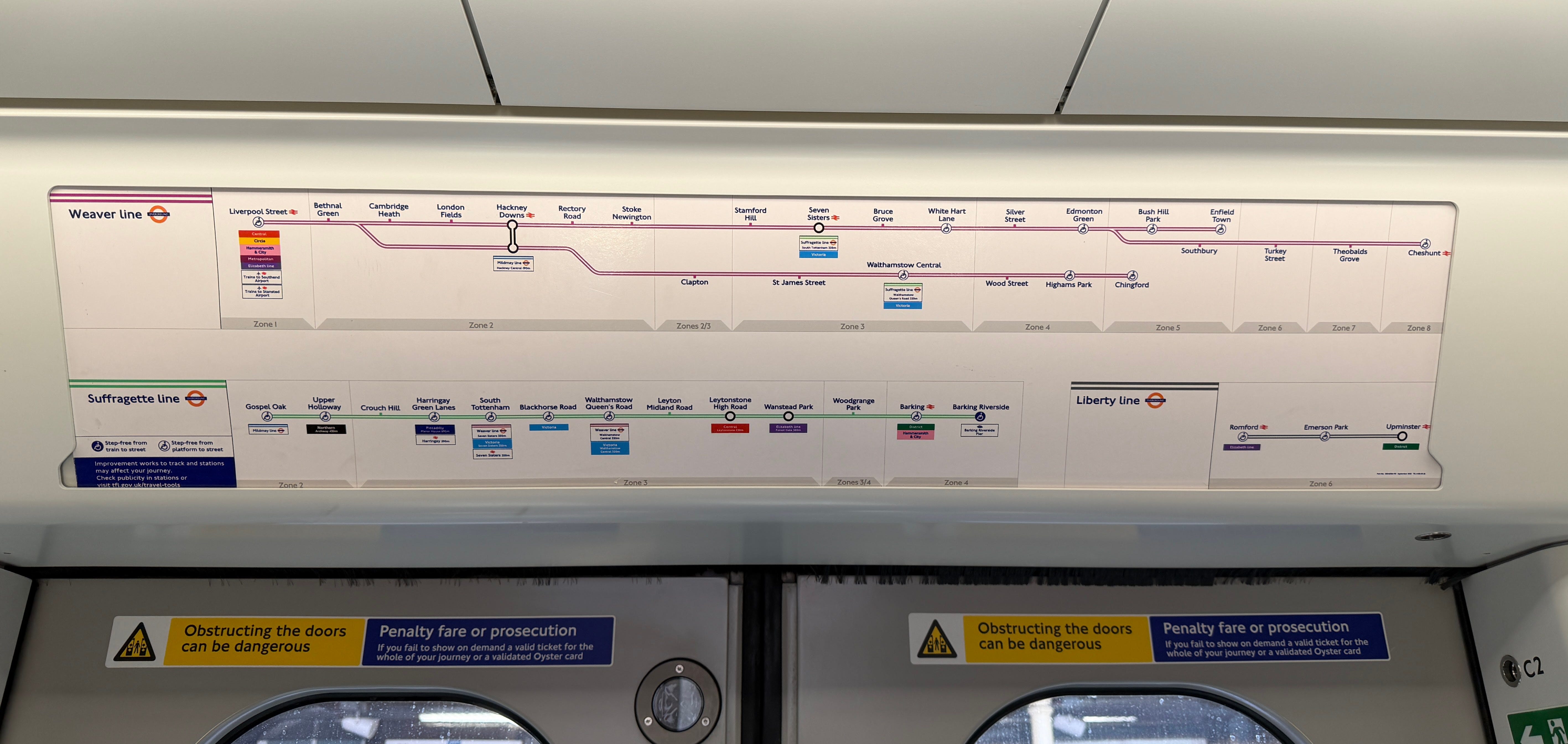
There are two distinct sides - one running to Chingford and another to either Cheshunt (which apparently I don’t say properly) or Enfield Town.
The justification for keeping it as one line I expect would be “because operationally it is one line”, which is admittedly true - trains arrive at Liverpool Street from one side before heading back out on the other.
But from a passenger perspective, they’re very much not the same line.
Those travelling on either side are - for the most part - surely mutually exclusive, unless they’re heading to Bethnal Green or Hackney Downs. And even at Hackney Downs (the last station before the two routes diverge), the interchange is a tedious trudge down a rather long staircase, across an underpass and back up again. (Keeping Cheshunt and Enfield Town services grouped together is much more forgivable, given they’re effectively line-end branches.)
Introducing these identities had nothing to do with operational minutiae - it was about passengers and how they navigate the network. Keeping these two as the same line even though they only share three stations out of twenty-five, is probably complete nonsense.
The result is passengers who find out they’re on the wrong train when they’re at the end of a branch they had no intention of being on (I’ve witnessed people’s eyes glaze over as someone tries to explain how to get back to where they thought they were going).
And then there’s platform franken-diagrams like this:
One of my earliest posts was about what I dubbed “inverse wayfinding” found on roads in the south of Italy. It seems kinda fitting to mention it here:
Driving in Italy - respect the chaos.

tl;dr: Italian road signage goes so far out of its way to break every rule of wayfinding that it’s frankly hilarious, and I love them for it.
Unfortunately now that the renaming exercise is out of the way and the new enamel signs brandishing “Weaver line” have been installed everywhere, we’re stuck with this. (I certainly don’t expect there’ll ever be political willpower to justify changing it any time soon.)
Is it worse than before? Maybe, if only because people might assume that “Weaver line” is enough to mean it will go to wherever they’re going, whereas before the Overground had enough ambiguity as a whole that they might’ve been inclined to check a train’s destination before boarding.
One final example: here’s a poster from this last weekend, in which Network Rail told people going to a BTS concert (whatever that is…) to take the Weaver line to White Hart Lane station:
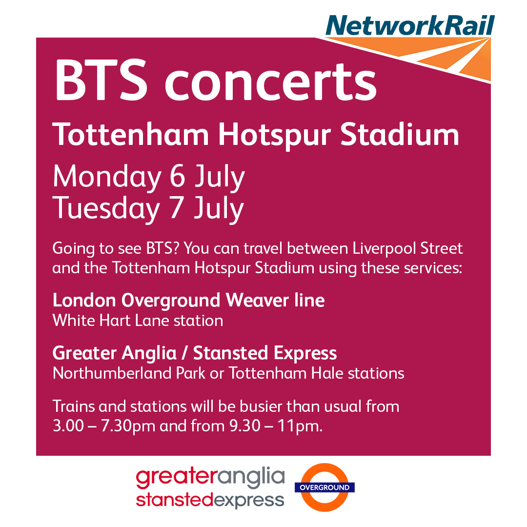
They fail to mention that half of all Weaver line trains don’t actually go there.
Lining.
TfL have also sort of broken their own rules in trying to make these new line identities work within the scope of, well, their other rules?
Let’s say you have the Victoria line - it’s blue. Signage relating to the Victoria line has a solid blue strip at the top, which makes perfect sense. And as it’s a tube line, it also gets a solid blue line on the map.
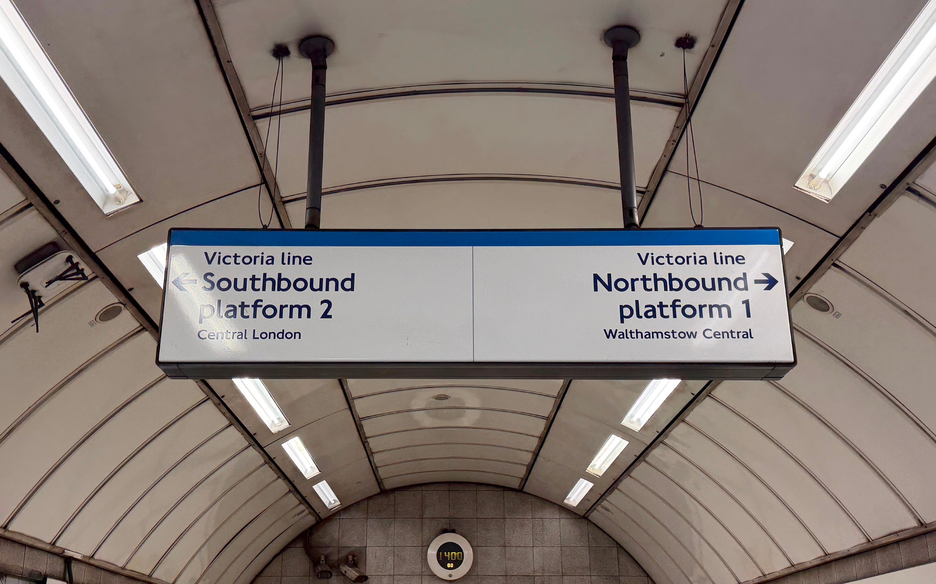
Next up, let’s look at the Elizabeth line - it’s purple (for royal reasons or something), and because it’s not a tube line, is represented by a pair of double purple lines on the tube map. But on signage in stations, it's still accompanied by a solid purple strip at the top in much the same way as the Victoria line, because the colour-name association is ultimately what’s important.
Same goes for the DLR, which has a teal strip on signage but double lines on the map, and previously the Overground, which had orange:
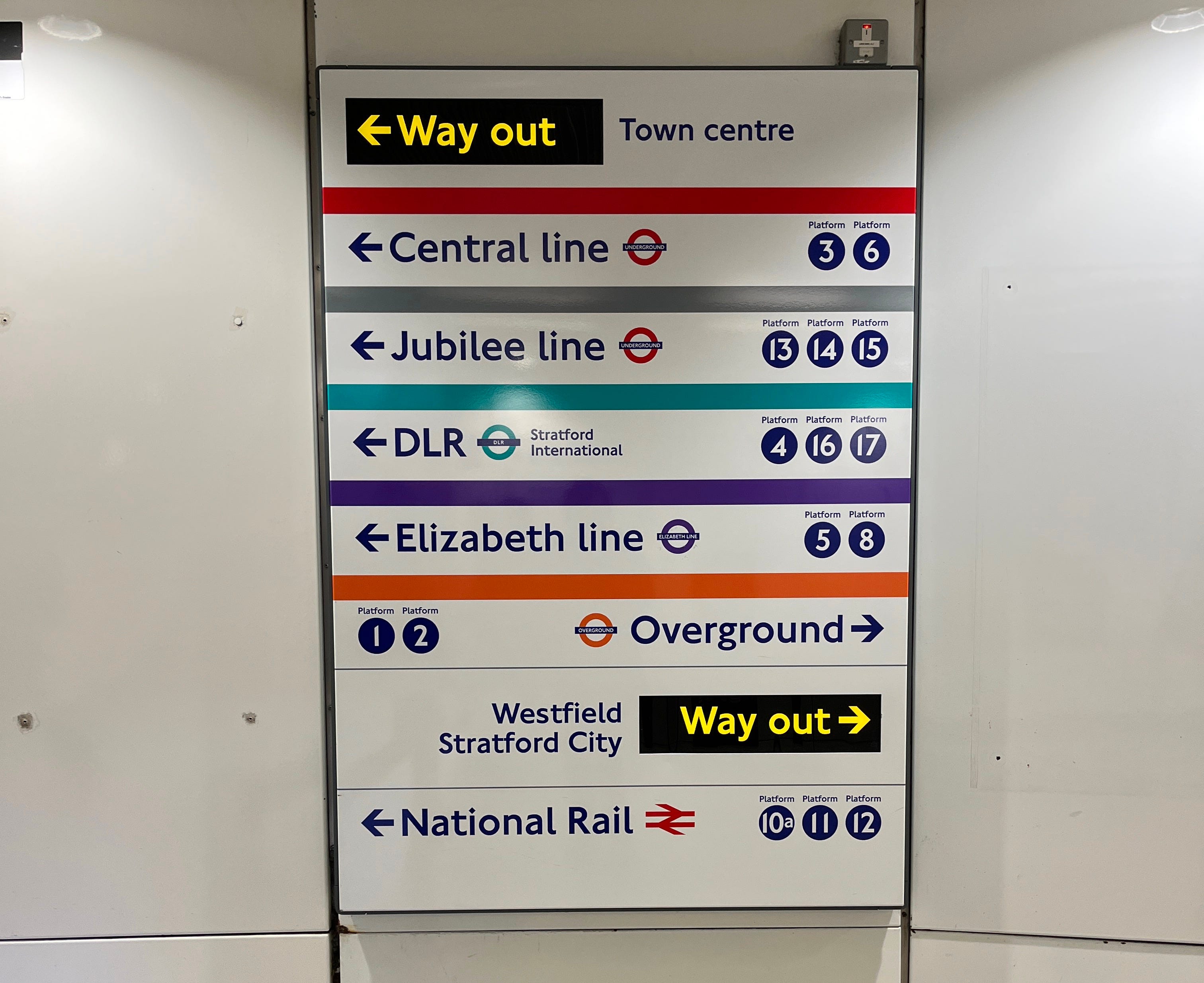
So you might think - OK, for these new Overground line identities, they’ll just use each line’s individual colour for the colour strip on signage, right? Except no, because that would’ve been too obvious. What they’ve actually done is chosen to replace the colour strip at the top of signs with… the double lines used on the map?
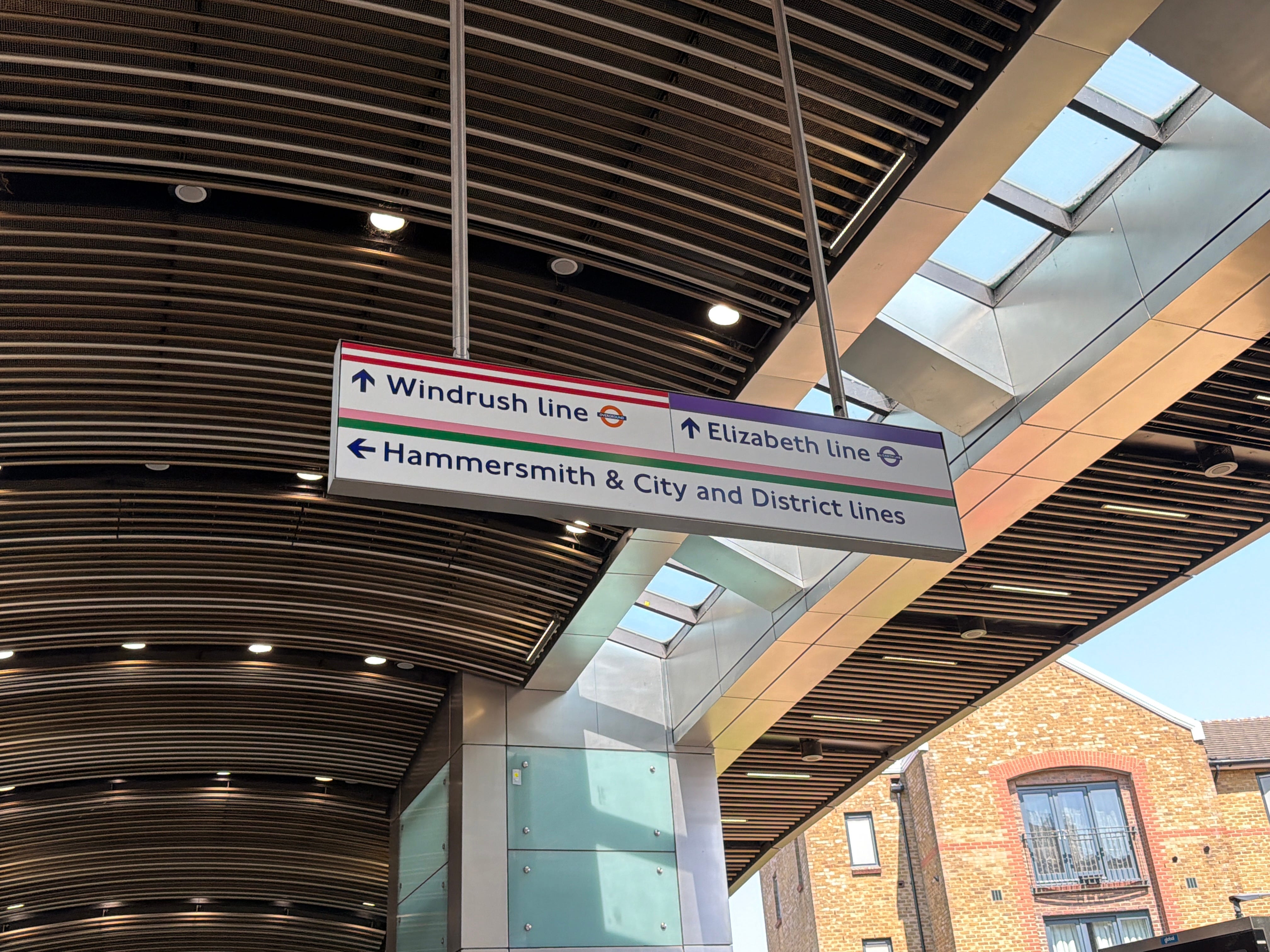
They also throw in a few ‘mode’ roundels in places for good measure, which I’m not sure necessarily add anything useful, but OK.
End(ing).
So what’s my point?
I’m not really sure that the whole Overground line identities exercise completely achieved what it set out to. It introduces six new line names that aren’t all that memorable, and six new colours (that even having written this post, I still couldn’t remember) and just throws them at London’s transport network in the hope that they’ll stick.
And did they? A bit. But not as well as I’d have expected from TfL. And in the case of the Weaver line, what they chose to do defeated the very point of the whole exercise.
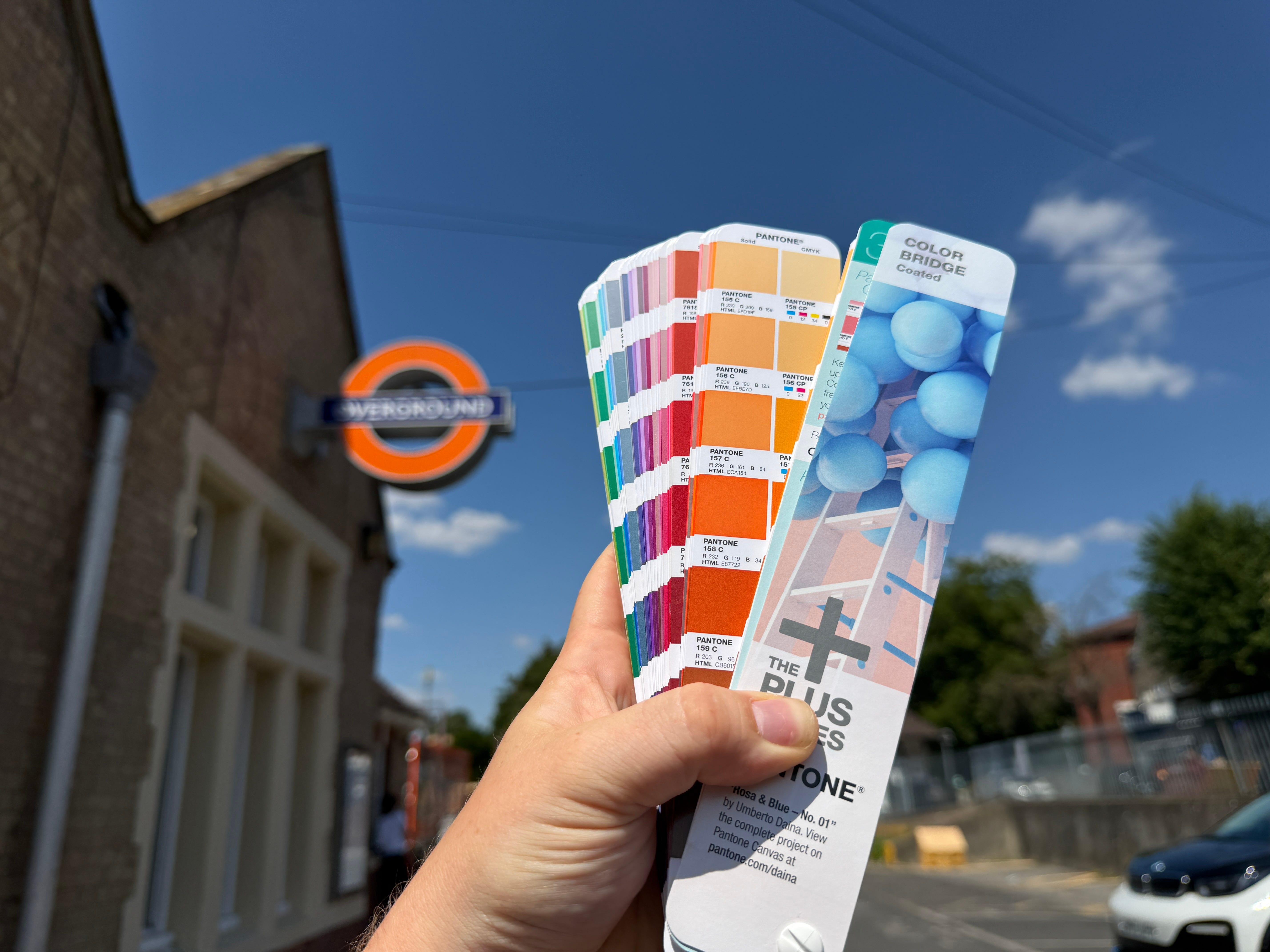
The biggest tragedy of all this is the watering down of the London Overground brand which was bold and well established, with seventeen years under its belt. The trains are still orange, the station roundels are still orange, but navigationally, the Overground name and colour is now… missing. They’ve spent a lot of money replacing many references to the Overground with these new line names and I’m not completely sure what for.
I don’t have the solution as to what the best way to distinguish between Overground lines was, but I do agree that it was necessary. I can see why they stuck to the “line name and colour” thing, but doing it in the way they have has, I reckon, just made things messy.
Anyway, I suppose it is what it is now.
I swear, I’m not even that old!
I do like the Overground lines' colour strip at the top of signs double lines. Eliz Line & Thameslink should be depicted the same way. Also having the orange Overground roundel on as much of the wayfinding signage as possible, like in the example(s) you've shown, would go a long way to cementing the Orange Overground mode on these newly renamed lines. Overall, frustrating wayfinding inconsistencies from TfL, given their usually stellar track record. Seems to have starting deviating during the, ahem, Johnson administration, with the no longer relevant but completely sucking up Elizabeth line name, calling it a 'line' in the name, the Boris Dangleway &c.