

Countdown: A better approach?
How I would do Countdown differently, and some ideas.

tl;dr: There’s plenty of ways that Countdown could be improved while using existing hardware, although no solution is perfect.
It’s no secret that I have beef with Countdown, something I tried to explain in my previous post, but I don’t think it’s necessarily fair to be out criticising something without at least proposing how it could be better.
Working with what you’ve got
While Countdown is getting on a bit, for the sake of argument let’s just assume that the current system is what it is and there’s no plans to replace it with something else. If we’re stuck with these screens for another 10 or 15 years, how do we make them better?
The most obvious thing to me is that - unless a stop is served by five, six or seven routes on a busy corridor - there shouldn’t be a lot of information to display on them. It certainly shouldn’t warrant waiting for the screen to scroll through more than two pages, when you have a display capable of showing several lines of text.
Problem solving
Let’s look at the problems with the current system and what we need to change to address them:
Bunching - services bunching together shouldn’t have a negative impact on the screen’s usefulness for people wanting to know about other routes. We need to shift away from individual buses and instead be route-first.
Low frequency routes - all routes should have equal priority for screentime irrespective of their frequency.
Redundant info - useless information should be lower priority (or not shown at all), which in this case refers to subsequent arrivals for each route.
Ambiguous info - there should be no ambiguity in what we’re showing, so we shouldn’t be presenting subsequent arrivals without making it clear that they are not the next bus.
Time wasting - the screen should be useful as much of the time as possible. This means minimising the amount of information so that it fits onto as few pages as possible.
Assumptions
Making design choices means making assumptions about our users in the context of our system.
We can assume passengers will be aware of what route they need to take, or at least we can assume that helping them to identify this is not the purpose of Countdown (maps, timetables and route information will be posted at any location where Countdown is present).
We can maybe assume that passengers aren’t going to expect to see a route that isn’t currently operating (such as a night bus during the daytime), but it might be useful to explicitly state which routes aren’t operating.
Can we assume that passengers know where each bus is going and only need to see the route number? I’m not sure, maybe? Maybe not.
What’s my instinct?
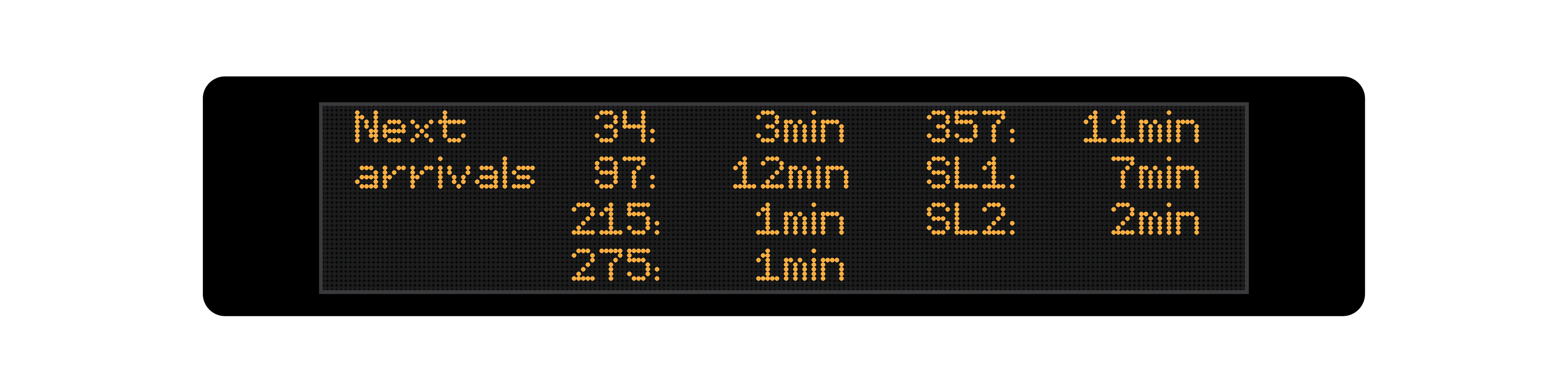
Here’s my concept design (each will use the same departure times for the same bus stop as used in my original example).
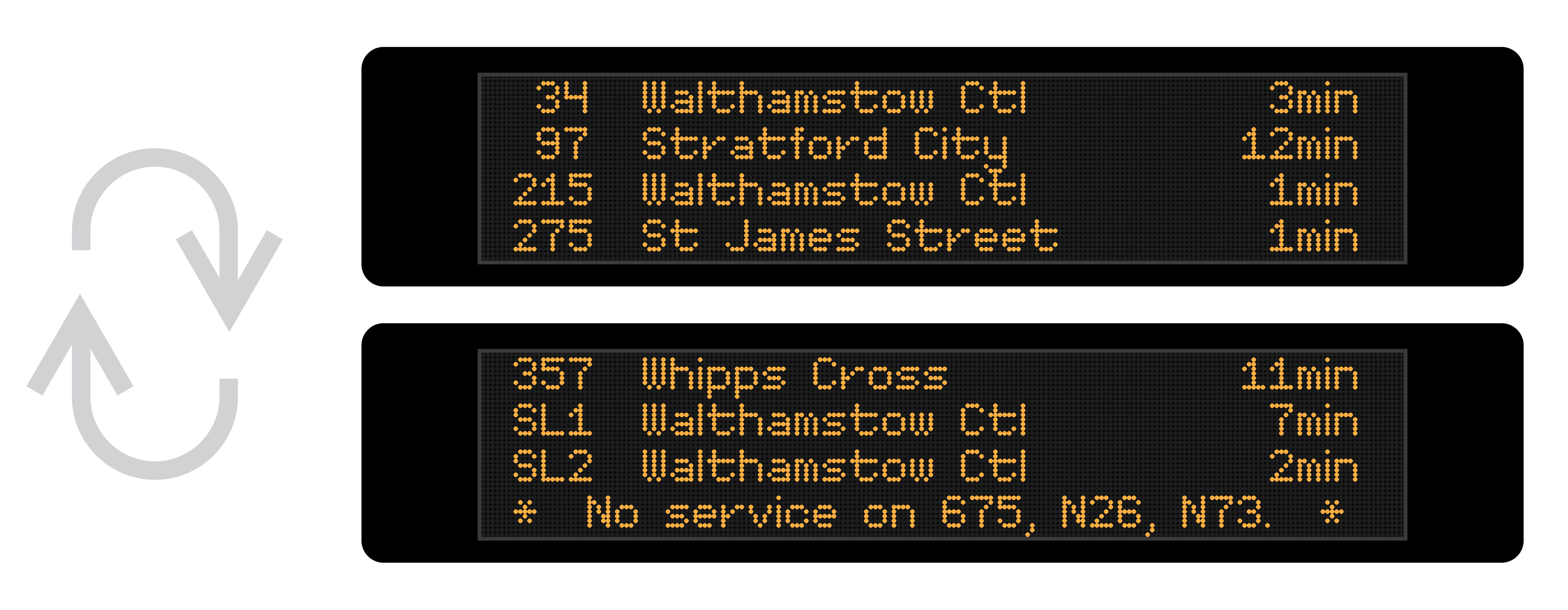
In this, I decided to take a “route-first” approach, showing only the next departure on each route. This resolves the useless and redundant info problems, the issues caused by bunching and for low frequency routes, and allows everything to be shown (for this example) over two screens. I’m also listing which services aren’t currently operating - just in case anyone was hoping to catch those.
This concept takes the information from my original example, on a 21 second (!) rotation over 3 pages, and condenses it to a 14 second rotation over 2 pages, reducing the time that the page you want is not displayed (i.e. the screen is useless to you) to 7 seconds in every 14, down from 14 in every 21.
It also removes any ambiguous information. At no point do you know when a bus is coming but not know whether that is the next one on a given route. There is no room for guessing or doubt. These are the next buses - definitively.
Considerations
When implementing any sort of system there’s plenty of considerations to make regarding what you show and how you show it:
Sorting by arrival or route number? My strategy is to sort by what passengers will be searching for when they look at the screen, which I reckon will be the route number. (It could be the destination, in some cases, but there are problems with that as not all people ride buses to the end of the line, and routes can go a variety of different ways.) Route numbers in ascending order can be scanned quickly allowing people to find the bus they want quickly.
Do we need to show the destinations? If there’s space, by all means. The current system shows destination, and given the existing screens’ form factor allow for it, there’d be no justification to not have this useful bit of information.
What about routes with multiple variants or which are stopping short? Do we list them separately, or is the destination of only the next one shown? This one is an “it depends” - and it’s a judgement call I didn’t need to take in the example. If it’s a frequent enough occurrence that buses with the same route number have different destinations, then it would be wise to separate these out. If there are buses with variation route numbers (e.g. 7 vs 7A) which take different routes to the same destination, or follow the same trunk route and then deviate from one another at the end, I would lean toward treating these as separate routes.
Heuristics
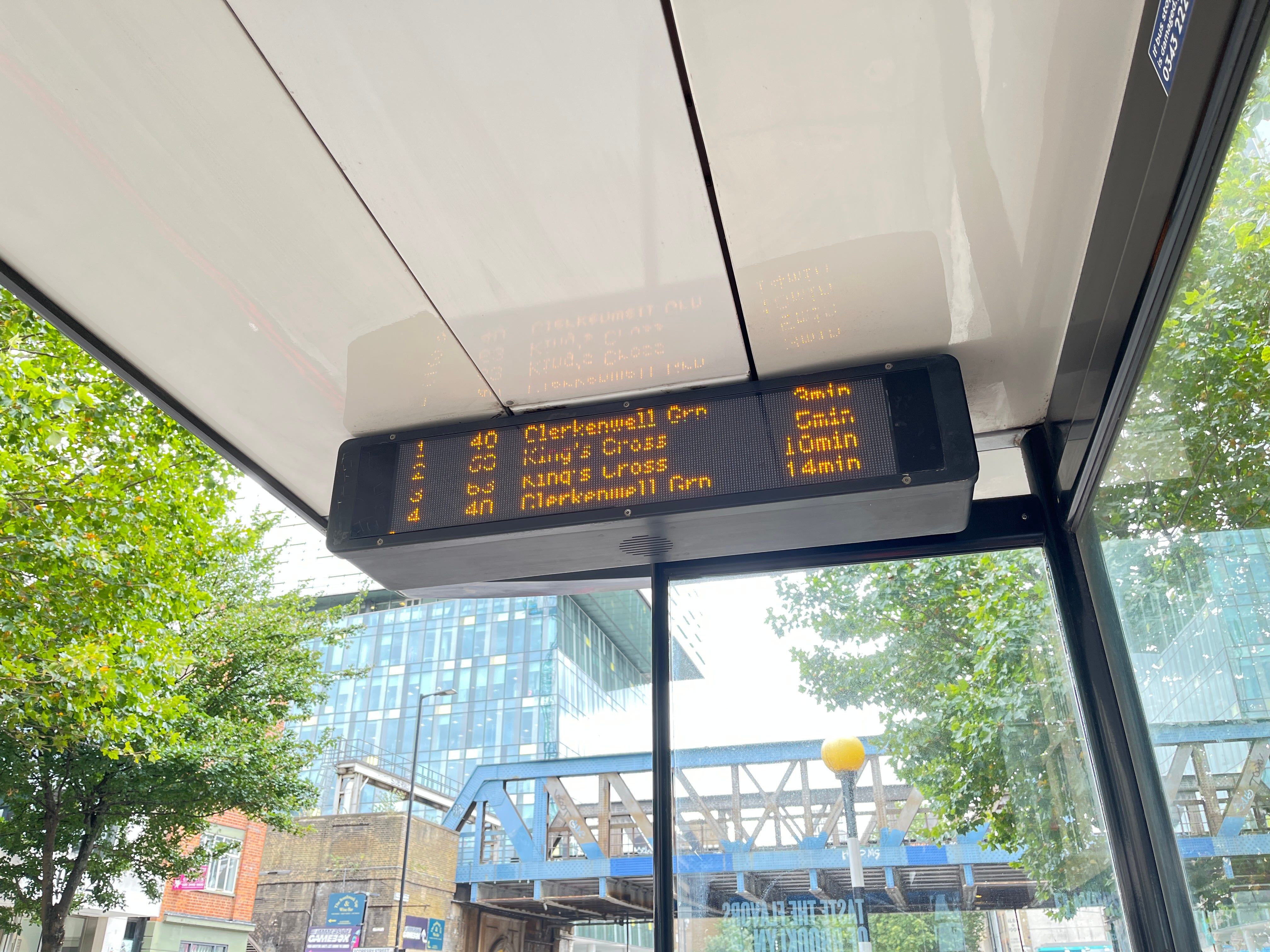
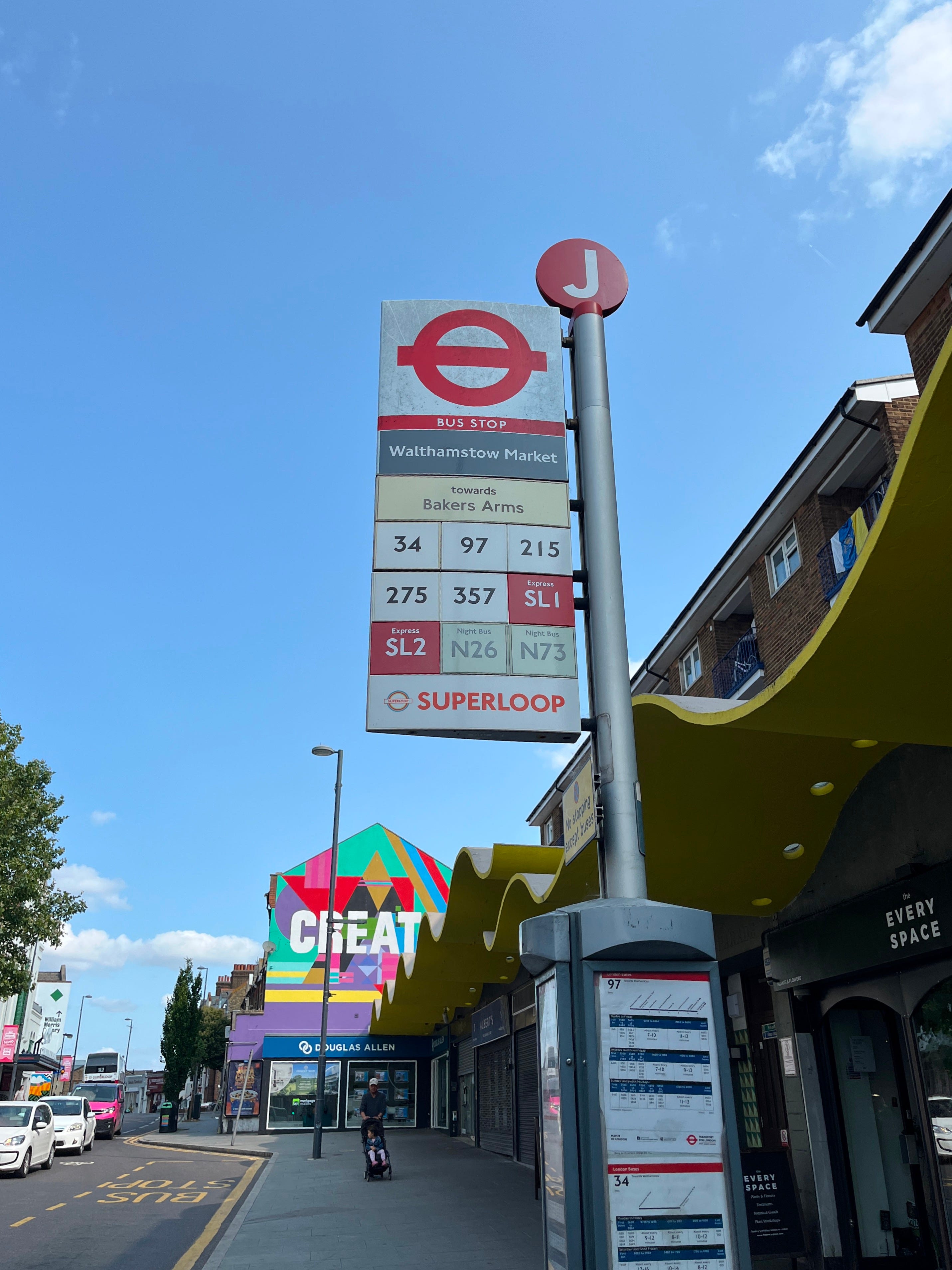
The stop I chose to use for this example - Walthamstow Market stop J - I had picked as an example of a stop I was familiar with, which is served by a fair number of high frequency routes.
(As an aside, it turns out that in the time since I last used this stop, the entire bus shelter was replaced, and the trusty Countdown sign vanished in the process. I’d like to hope that it’s coming back - this is exactly the kind of stop where it’ll be sorely missed.)
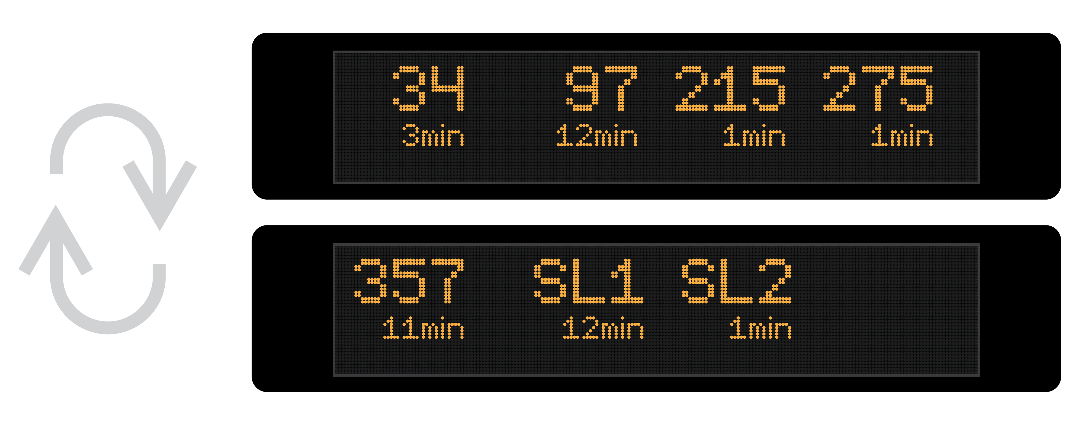
Anyway, local knowledge can be insightful in designing these sorts of systems - and a key question to also be asked is “who are the passengers?”. You’ll notice in the examples that four of the routes have their destination as Walthamstow Central - in particular a major bus station in this part of London which also happens to be the next stop on all of these routes.
How many passengers boarding a bus here are doing so on the routes terminating at the next stop? Some, for sure, but not many. You could say that really, we don’t need to show the next arrival for these routes - and to consider the stop effectively “set-down only”. This is another assumption that could be made (and one that doesn’t sit completely well with me) but I think it’s reasonable to consider the remaining routes at least higher priority than those which terminate at the next stop.
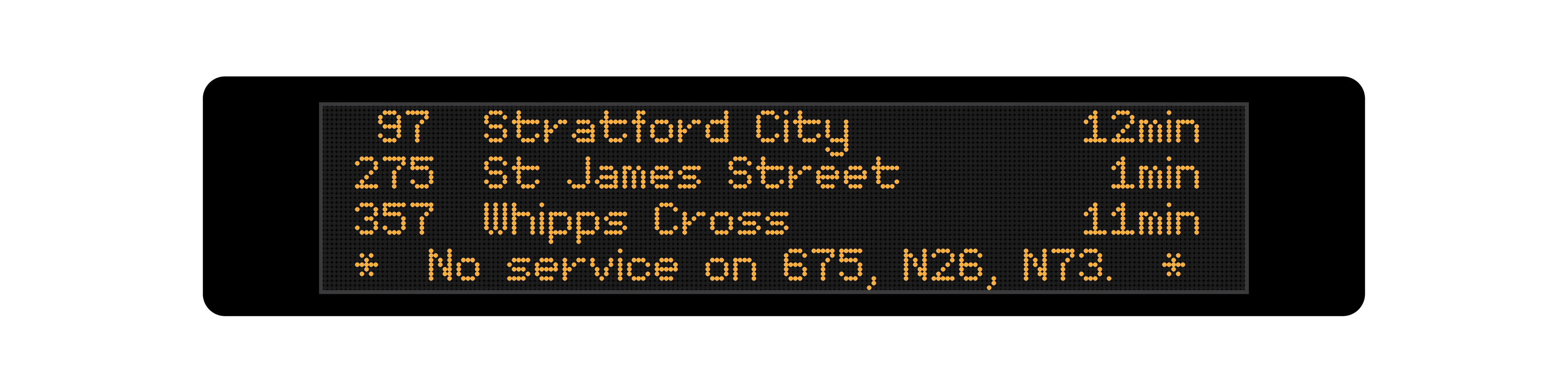
Applying this to my concept design, this leaves only three routes which will fit comfortably on a single page. That means no scrolling, no useless information, no waiting at all - incredible.
Some other ideas
There’s of course other ways you could do this, and still arguably offer improvement over the current system. Here’s two I came up with:
Super-condensed
This one omits route destinations altogether, giving space for 8 arrivals on one page. With the route-first approach, this will mean for most stops, all routes can be displayed at once with no waiting. Sacrificing destination information is a disadvantage, however, and there’d be no way to distinguish between variations or short-stopping services.
Big numbers!
Here we have route numbers displayed in double-size lettering so that they can be even-more-easily identified at a glance. This brings us down to four routes per page, but there’s not a lot of information to digest at once and so, potentially, page rotation speed could be increased.
Again this omits destination information and the problems that come with that. The final line is available and could be used for displaying additional service information.
Debrief
What I’ve suggested allows Countdown to be more useful without replacing the hardware or making any meaningful non-software related changes.
I’m sure there’s a “well, actually” brigade out to tell me how my concept isn’t an improvement and how sacrificing subsequent arrivals of buses on each route is a bad thing. They’re wrong, of course.
There are always trade-offs to be made when creating a system like this, and for the other ideas of removing “set-down” stops and sacrificing destination information for each route, there’s valid arguments to be made about why these are bad things. Does keeping this information make the screens more useful for most people, or just a select few? Do they make the screens more accessible or less accessible? Do they improve the experience of ‘using’ the screen?
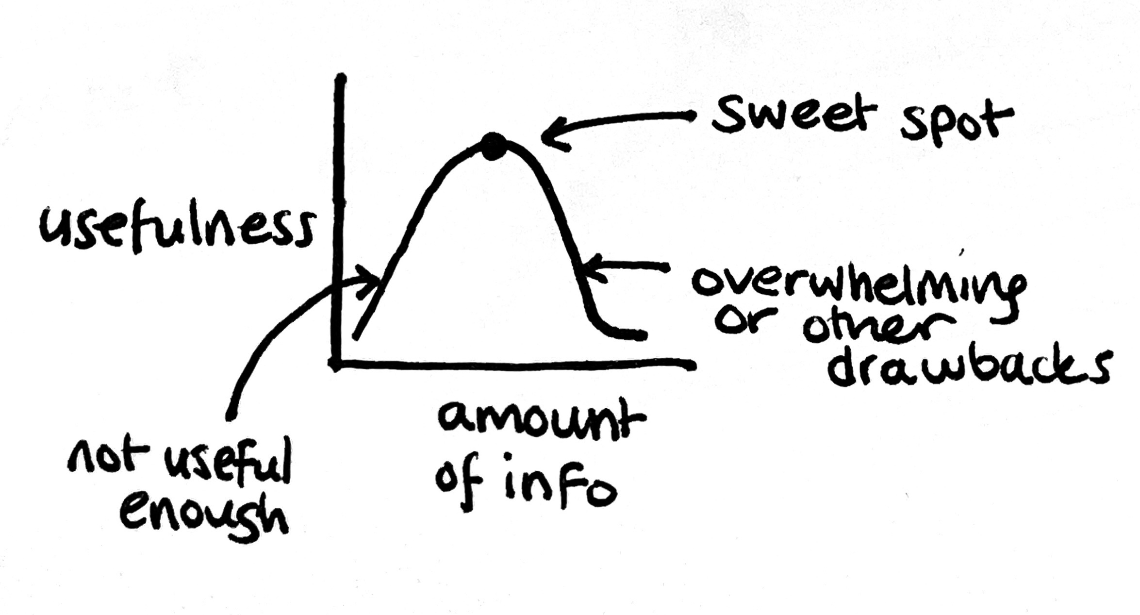
But it’s so important to remember - more information is not necessarily more useful. More information can reduce utility, and the current implementation of Countdown is the epitome of this.
Next post:

Previous post:
